


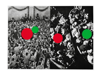
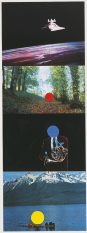
John Baldessari, "Hegel's Cellar: Two Boats," 1986. Photogravure, aquatint. 19.5 x 26.5 inches. Publisher: Marian Goodman Multiples, edition of 35. Courtesy John Baldessari and Marian Goodman Gallery, New York.
Over the past couple of years, the art world has been ebulliently celebrating the work of conceptualist John Baldessari – a well deserved paean to this highly influential and groundbreaking artist. To begin, he was given the Golden Lion Award for lifetime achievement at the 2009 Venice Biennale. John Baldessari: Pure Beauty, a retrospective exhibition organized by the Tate Modern and the Los Angeles County Museum of Art, opened in London last October and is now in its final days at the Metropolitan Museum of Art through January 9. The exhibition and accompanying catalogue (Los Angeles County Museum of Art; Delmonico Books/Prestel, 2009) summarize the artist’s career from the early 1960s with a focus on unique works (as well as several important artist’s books from the 1970s). A complementary touring exhibition and catalogue of his prints, John Baldessari: A Print Retrospective from the Collections of Jordan D. Schnitzer and His Family Foundation, organized by the Fine Arts Museums of San Francisco and the Jordan Schnitzer Family Foundation, has traveled to a handful of venues across the country and will be on view February 26 – June 26, 2011 at the Palm Springs Art Museum and February 4 – May 13, 2012 at the Museum of Contemporary Art San Diego. In addition to the aforementioned exhibition catalogues, The Prints of John Baldessari: A Catalogue Raisonne 1971–2007 by Sharon Coplan Hurowitz and Wendy Weitman (Hudson Hills Press LLC, October 2009) carefully documents, beautifully illustrates, and insightfully discusses his multiples on paper (with the exception of artist’s books). His work will also be featured in the upcoming Sydney Festival, January 8-30, Sydney, Australia. Several galleries showed his work this past fall as well: Marian Goodman and Gemini G.E.L. at Joni Moisant Weyl in New York; 1301PE Gallery in Los Angeles; and Fondazione Prada in Milan. In the media, Baldessari was profiled in the October 18, 2010 issue of the New Yorker (“No More Boring Art” by Calvin Tomkins); featured in the Systems episode in the 2009 season 5 of the Art:21 documentary series; the subject of an a documentary on the Tate Channel; and discussed in several other articles and reviews too numerous to mention.
Add to this abundance this current post, which is naturally focused on Baldessari’s prints. In his own words, “Fingerprints and footprints can be repeated, and that’s why I make prints endlessly” (Hurowitz and Weitman, opening page). Quips aside, Baldessari has created a formidable body of editions and artist’s books (in addition to documenting his own footprints) in his lifetime – what he refers to as his “cheap line.” Yet Baldessari’s irreverent and playful prints require an intellectual workout as rigorous as any other medium in which he chooses to work. A self-described “failed writer” who “builds with images the way a writer builds with words” (public interview with David Salle at the Metropolitan Museum of Art, November 20, 2010), Baldessari’s work is concerned with the idea of visual information as signifier and a means of communication, combining stock imagery, colors, and text to create intricate and taut visual puzzles. His aim is to create enough “tension” between found images in order to illicit questions and curiosity. He has often spoken of the esteem he has for his viewers, who he describes as “tremendously sophisticated. I don’t think you need to pander to an audience, but once they’re looking then the question becomes how to hold their attention” (Tate Channel online documentary).
Though Baldessari used discarded printed billboards as source material for a handful of early canvases in the ‘60s, he avoided traditional printmaking because he was convinced it was primarily a commercial enterprise. However, he toyed with the idea of a print in its most basic form in the 1970 work Evidence: A Potential Print, currently on view in the retrospective exhibition at the Met. Comprised of a typed document and a black-and-white photograph documenting a footprint, the piece is tangentially related to his career-altering work Cremation Project (1970), in which he publicly announced, planned, and commemorated the death of his “body” of work to date (those in his possession), denouncing painting as his primary mode of expression. The resulting ashes were used in a few subsequent projects. In this work, Baldessari built upon the idea of ashes and death that he explored in Cremation Project, as well as the notion of what constitutes a print. A photograph documents a pile of ashes in the corner of a nondescript, institutional room. To the left of the ashes is a white box, presumably the former receptacle for the remains of his paintings. In the pile is an odd-shaped footprint. The narrative on the accompanying text begins, “Most prints are on paper. The materials used as an ink might vary more, but not a lot. What is seen here is an attempt to avoid both ink and paper…” followed by an explanation of the Yorkshire tradition of foretelling a potential death in the family using ashes on St. Mark’s Day, April 24 (an identifiable footprint the next morning indicated the individual’s demise in the coming year).

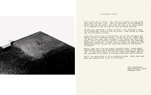
John Baldessari, "Evidence: A Potential Print," 1970. Typed text, ashes. Photo: 8 x 10 1/4 x 1 1/4 inches, typed text: 11 3/4 x 9 1/2 x 1 1/4 inches. Courtesy John Baldessari and Marian Goodman Gallery, New York.
Shortly after Evidence: A Potential Print, Baldessari did in fact create his first print – I Will Not Make Any More Boring Art. Given his previous aversion to the monetary aspects of printmaking, it makes sense that it was editioned to raise funds for the Nova Scotia College of Art and Design, Halifax, where he had been asked to show his work in the spring of 1971. The lithograph was created in conjunction with the now renowned exhibition for which – at Baldessari’s request – students endlessly wrote the phrase “I will not make any more boring art” on the gallery walls. For his part, Baldessari videotaped himself doing the same thing on notebook paper in his studio in Southern California (the video is also on view at the Met). The idea of asking the students to participate was born of necessity – the college did not have the funds to fly Baldessari to Halifax (hence the benefit print) – but it is common for the artist to leave execution of his work to others. Baldessari has said, “I would like to think that I am purely a strategist. You figure out how to do something and that’s that. The doing of it is not very interesting because I have already done it in my head” [Liam Gillick, “I Will Not Make Any More Boring Art,” Art Monthly (187, June 1995, 3-7)].

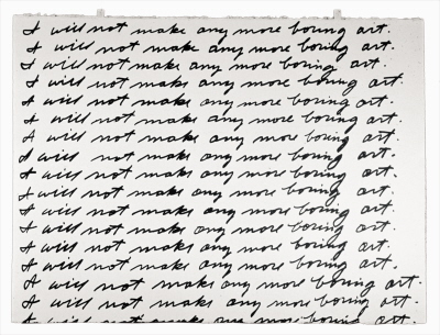
John Baldessari, "I Will Not Make Any More Boring Art," 1971. Lithograph on Arches paper. 22 1/4 x 30 in. Publisher: Nova Scotia College of Art and Design, Halifax. Edition of 50. Courtesy John Baldessari and Marian Goodman Gallery, New York.
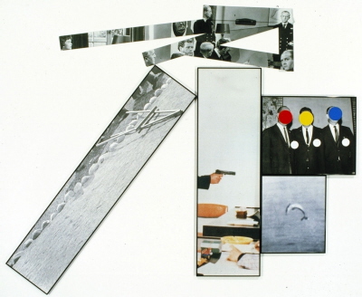
Baldessari created a few printmaking projects in the decade following this initial edition, including the portfolio Raw Prints (Cirrus Editions, 1976), but he hit his stride in the 1980s beginning with the portfolio Black Dice (Peter Blum Edition, 1982). At this point in his career, Baldessari was using found photographs as source material – primarily stock images from early Hollywood films, newspaper photographs, and postwar advertising. He was drawn to the generic nature of such images, their role in creating a shared visual culture, and the power they have to reveal subconscious thoughts and uncover the viewer’s “emotional baggage” (Coosje van Bruggen, John Baldessari [New York: Rizzoli, 1990], 163). For this project, he picked a still from a crime movie, cut it into nine parts, and created a plate for each section, reduced to its basic elements (plates 1 and 2 illustrated; see the entire portfolio on the Peter Blum website). Through this exercise, he explored the nature of visual language and how it is possible to build a whole from its parts – an idea that was inspired by his interest in linguistic theory and semiotics, particularly the theories of Wittgenstein, Barthes, Lévi-Strauss, de Saussure, and others (for further discussion see Rainer Fuchs, “Uncovering the Hidden” in Jessica Morgan et al., John Baldessari: Pure Beauty). For Black Dice, Baldessari chose to work in aquatint because it was Goya’s favored medium – he greatly admires the master’s prints, which have been a source of inspiration throughout his career. Under the guidance of Master Printer Peter Kneubühler, Baldessari worked on the plates with his own hand – a departure from his standard mode of working that instilled him with a deeper appreciation of Goya’s technique and provided him with a solid understanding of the process that would carry through in many of his future print projects.


John Baldessari, from left: Plate 1 from "Black Dice," portfolio of nine color etchings and one silver gelatin photograph, 1982. 8 x 9 1/4 in. Publisher: Peter Blum Edition, New York, edition of 35. Courtesy John Baldessari and Peter Blum Edition, New York. On right: Plate 2 from "Black Dice," portfolio of nine color etchings and one silver gelatin photograph, 1982. 16 1/2 x 19 3/4 in. Publisher: Peter Blum Edition, New York, edition of 35. Courtesy John Baldessari and Peter Blum Edition, New York.
Baldessari’s next major series of prints, Hegel’s Cellar (Marian Goodman Multiples, 1986), combined his interests in philosophy and identity. Returning to his customary mode of working, Baldessari provided maquettes for each plate that were primarily executed by Master Printer Patricia Branstead under his direction – he later traveled to the studio to proof and add handwork. For this series of ten aquatints, Baldessari juxtaposed stock imagery in montages to suggest Hegel’s theory of an “abyss (or cellar) as a psychic space where one preserve[s] images unconsciously” (Wendy Weitman in The Prints of John Baldessari: A Catalogue Raisonne 1971–2007, 23-24). As Weitman observes, the plate titled Two Boats (illustrated at top) is an example of Baldessari’s investigations behind the nature of “group think” – the individual surrendering selfhood to the masses – a phenomenon he first studied in Elias Canetti’s 1960 treatise Crowds and Power. In a further exploration of the nature of individuality, Baldessari had begun to cover the faces in his stock imagery with dots so they would function as general types rather than personalities. This had the added benefit of forcing viewers to focus on other aspects of the composition and details that might have been otherwise overlooked. The dots were white at first, but later he began to use primary and secondary colors as defined on the color wheel. Baldessari chose this limitation in order to avoid aesthetic color choices, instead following an arbitrary system.
The 1988 prints The Fallen Easel and Object (with Flaw) represented a major shift in Baldessari’s approach to presentation, allowing a more complex relationship between his found imagery. In both prints, Baldessari expertly contrasts unrelated photographs to suggest a mysterious and/or ominous undercurrent. The dynamic tension between the figures and objects is enhanced by jarring angles and haphazard stacking. Though he had explored this approach in unique works since the 1970s, technical advances in printmaking allowed Baldessari to dictate the form and position of each element in these works to follow its function within the piece. He also took advantage of recent technologies that allowed prints to be fused to a metal backing and mounted directly on the wall. This technique was used for the upper elements of The Fallen Easel and the central figure in Object (with Flaw). At this point, he also began to select simple black frames for his work – a style he still prefers. The conventionality of framing had previously irked him, but his dealer Ileana Sonnabend persuaded him to consider protecting his work after several years of witnessing damage to his unframed paper-based media.

John Baldessari, "The Fallen Easel," 1988. Lithograph and screenprint on paper and metal. 74 x 95 in. overall. Publisher: Cirrus Editions, Los Angeles, edition of 35. Courtesy Courtesy John Baldessari and Cirrus Editions, Los Angeles.
The central photo in The Fallen Easel foretold Baldessari’s pending shift to using color imagery in the 1994 series A French Horn Player, A Square Blue Moon, and Other Subjects (Gemini G.E.L.). In a recent discussion with Wendy Weitman, he attributed this change to boredom – a force Baldessari frequently cites as an impetus to his work, “I guess the boredom part of me is something genetic…you just have to get to the studio…and eventually you get bored and you’ll try not to be bored and then that’s the beginning of creativity” (Tate Channel online documentary). At the same time, Baldessari also began to use colors beyond the basic primary and secondary palette, a trend that is more prevalent in his most recent work.

John Baldessari, "A French Horn Player, A Square Blue Moon, and Other Subjects: French Horn Player (with Three Contexts -- One Uncoded)." Lithograph and screenprint, 60 x 22 in. Publisher: Gemini G.E.L., Los Angeles, edition of 60. © 1994 John Baldessari and Gemini G.E.L. LLC, Courtesy Courtesy John Baldessari and Gemini G.E.L., LLC, Los Angeles.
In the same way that Baldessari isolates elements of a composition, he has also disassociated various aspects of the human body from the whole. In his usual mode of questioning convention, Baldessari focuses on body parts that are usually overlooked: ears, nose, toes, legs, arms. Ears and noses have been a source of particular fascination. As quoted by Hunter Drohojowska-Philp, “Somehow I got into the idea of noses and ears. For a long time I have been interested in parts of things, the whole philosophical issue of why something is a part and something is a whole, and do a number of parts make a whole…I find that more and more with an ear and nose together, you fill it in” (John Baldessari: A Print Retrospective from the Collections of Jordan D. Schnitzer and His Family Foundation [San Francisco: Fine Art Museums of San Francisco; and Portland: Jordan Schnitzer Family Foundation, 2009], 22). This idea is playfully explored in Noses & Ears Etc.: The Gemini Series (Gemini G.E.L., 2006), where Baldessari has eliminated all detail aside from noses and/or ears in his subjects with a solid block of color, thus transforming the image to a silhouette. In some cases, he also isolated the nose or ear as a block of color. The prints were executed in two or three layers on thick Sintra boards, lending them a slightly three-dimensional effect. Baldessari likewise improvised on the ear in Six Ear Drawings (Complementary Colors) (Edition Jacob Samuel, 2007), a portfolio of small etchings – the first drawing-based prints he had created in several years. These prints reveal Baldessari’s reverence for Matisse, whom he cites as a role model, “[his work] looks like something a child could do and yet it’s so profound” (Salle interview at the Met).

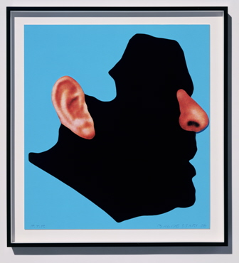
John Baldessari, "Noses & Ears Etc.: The Gemini Series: Profile with Ear and Nose (Color)." Two-layer screenprint construction (mounted to Sintra and hand cut), framed. 34 1/4 x 32 x 3 in. Publisher: Gemini G.E.L., Los Angeles, edition of 45. © 2006 John Baldessari and Gemini G.E.L. LLC. Courtesy John Baldessari and Gemini G.E.L., LLC, Los Angeles.
Baldessari has further explored his fascination with body parts in a recent series of six prints titled Foot and Stocking (With Big Toe Exposed) (Gemini G.E.L., 2010). The source imagery in this case is original: he asked his staff to pose their feet for photographs that were later blown up to a monumental scale. Everything but the big toe was blocked out and covered with black fabric to resemble a sock. Vibrant colors in the background highlight the detail of the toe images and contrast with the deep black of the fabric. By titling each work with the name of the subject, Baldessari hints that this is in effect, a portrait. He has cleverly flipped his own game. In place of his customary approach to blocking out the identifiable features of his subject with a round disk, here he has highlighted a distinguishing feature (also a rounded form) – their big toe. With a lack of detail elsewhere in the composition, we are forced to focus on the differences between them.


John Baldessari, "Foot and Stocking (With Big Toe Exposed): Phil." Screenprint with fabric and paper collage. 50 x 33 in. Edition of 45 © 2010 John Baldessari and Gemini G.E.L. LLC, Courtesy John Baldessari and Gemini G.E.L., LLC, Los Angeles.
By now you are surely laughing. Yet Baldessari eschews any humorous intent in his work, “If I were trying to be funny, I wouldn’t be doing this” (Salle interview at the Met). At the same time, he allows that people will (and should) bring their own meaning to his work, and that the work itself has meanings apart from his intentions – a Duchampian notion that he has embraced from the start of his career. Like Duchamp, who he has often cited as a major influence on his work, Baldessari has remained endlessly curious and engaged with the notion of what makes art “Art” and has shown that many banal or humble topics can be transformed into worthy subjects for consideration. His explorations over the decades – even within the specialized topic of prints and multiples – have taken too many forms to fully investigate in the space of a simple blog post. However, as detailed at the outset, there is a wealth of material available on the web, in print, and on view to delve deeper. Be assured that the journey will reward.
Further exploration:
- Baldessari’s website
- 2009 interview with Constance Lewallen at the Fine Art Museums of San Francisco on Baldessari’s prints
- Online catalogue raisonné: Gemini G.E.L. ,National Gallery of Art
Print publishers: