


Glenn Ligon. “Warm Broad Glow (reversed),” 2007. Photogravure aquatint. 24 ½ x 35 ½ in. (sheet), edition of 35. ©Glenn Ligon, image courtesy Burnet Editions, New York.
Among the artists featured in Art21’s new season, Glenn Ligon stands apart in his deep involvement with the idiom of printmaking. Like many contemporary artists, Ligon uses the medium as a means to his artistic ends. The repetitive and commercially-produced imagery and text that form the basic elements of his artistic vocabulary demand an approach that is somewhat mechanical and removed; a majority of his works spring from printed materials. Likewise, he has traditionally favored a basic black-and-white palette (emphasizing the variance that can be found there), though he has recently expanded to a wider spectrum. Using the standard printing techniques of stencil, etching, lithography, photogravure, and screenprinting, Ligon reveals the fraught nature of his racially-charged source materials through commentary and/or visual manipulation.
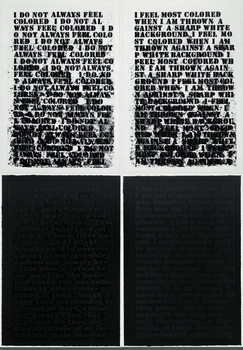
Ligon is best known for his stencil-based imagery, in which he transcribes a chosen text to either canvas or paper with a plastic stencil using oilstick. The viscous material adheres to the stencil and builds up with the application of each letter, blurring and smearing the text to a greater degree as he progresses. Ligon perfected this signature approach in 1990 with Untitled (I Feel Most Colored When I am Thrown Against a Sharp White Background). In this and other paintings from the same period, he hit upon a potent combination of signifiers and facture that are both individualized and anonymous at the same time. The “I” of the voice and the evidence of hand-work allows the viewer to feel invested in the message, while the anonymity of the delivery and the commercial lettering opens interpretation to a wider frame of reference. Ligon worked exclusively in this vein for a few years (alternating black-on-white and black-on-black, depending on the text), working with a variety of text sources, including his own words, literary works like Invisible Man by Ralph Ellison and “Stranger in the Village” by James Baldwin, and quotes from black leaders (see more on his choice of texts in “History,” episode 3 of Art in the Twenty-First Century, Season 6). The works are mesmerizing, even if one is unfamiliar with the source, inviting speculation on the impact of race relations on identity on both personal and universal levels.

Glenn Ligon. “Four Untitled Etchings,” 1992. Suite of four etchings with softground etching, aquatint, spitbite, and sugarlift. 25 1/8 x 17 1/4 in. each (sheet), edition of 45. ©Glenn Ligon, image courtesy Glenn Ligon Studio.
In 1992, Ligon created Four Untitled Etchings, his first limited edition as well as the inaugural project for Burnet Editions. The pieces are based on the artist’s aforementioned canvases that appropriate texts by Hurston and Ellison (see discussion on the National Gallery of Art website). As described by master printer Gregory Burnet, it was important to Ligon that the process be true both to his concept and working method in the studio (interview with the author) and it took a number of trial runs to hit upon a successful approach. The stenciled letters were first lightly etched into the copper plate, then it was coated with hardground. Ligon then went over the letters with a stencil using a cotton swab dipped in naptha. The solvent removed the ground on the letters, but also seeped underneath and randomly removed the ground around them. The exposed metal was then etched, the plate cleaned, and the ground reapplied. Ligon again traced the letters using the same process, and the plate was etched another time. This was repeated several times until a satisfactory degree of texture and depth was achieved. Finally, the plate was treated with aquatint (so the recessed areas would hold ink). The resulting prints–which have a visual impact that is equal to, but distinct from, the paintings–are now among the most significant original etchings created in the 1990s. They are included in a number of public and private collections, including that of President and Michelle Obama, who also own one of his canvases.

Glenn Ligon. One plate from “Narratives,” 1993. Suite of nine photogravures on chine collé. 28 x 21 in. each (sheet), edition of 45. ©Glenn Ligon, image courtesy Burnet Editions, New York.
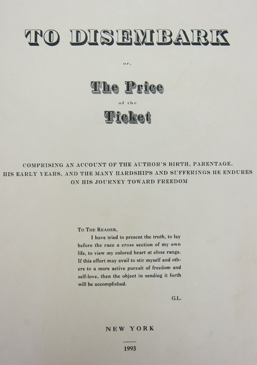
Since this successful collaboration twenty years ago, Ligon has continued to create limited editions. He has primarily worked with Burnet, but has also collaborated with Dieu Donné Papermill, Polígrafa Obra Gráfica, and others. Some of the prints stand alone, while others relate directly to his works in other media. His 1993 installation piece To Disembark included two suites of prints titled Narratives and Runaways (both 1993) that complemented three unique wall drawings (stenciled texts) and nine sculptural wooden crates. The crates were conceived in homage to Henry “Box” Brown, an enslaved man in Virginia who shipped himself to freedom in 1849. They “emit[ted] barely audible sounds” and were marked with standard symbols for fragile contents (exhibition brochure, unpaginated). Both suites of prints were exercises in recreating historical documents of antebellum America – Runaways (all can be viewed on the website of the Museum of Modern Art) imitated posters that were printed by slave owners who sought to locate escaped men and women. These included descriptions and stock imagery of slaves and their owners. Ligon visually replicated such broadsides, replacing the descriptions with those of himself that he solicited from friends. Narratives was based on first-hand accounts of slavery that were transcribed and published by abolitionists in the 19th Century (Brown’s can be viewed in its entirety here). Ligon emulated the format and style of their title pages, but altered the titles and descriptions to be vaguely autobiographical, and updated the customary literary quotations with those of contemporary black writers including himself, Toni Morrison, and Hilton Als. Each of the images were printed to delicate chine collé papers of different tones – bright white, cream, ivory, tan, pale green – that emphasize the changeable nature of identity and experience (even in one individual, in this case, himself) that conceptually undergirds the work.

Glenn Ligon. “Cancellation Proofs,” 2003. Etching, aquatint, spitbite, and sugarlift with engraving. 28 x 19 ½ in. each (sheet), edition of 15. ©Glenn Ligon, image courtesy Burnet Editions, New York.
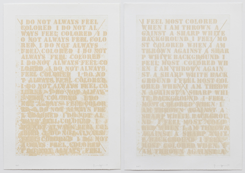
Ligon focused on unique work for several years, but he returned to printmaking in the early aughts when he became interested in deconstructing his own early works. Condition Report (2000), shows two adjacent images of Ligon’s breakthrough 1988 canvas Untitled (I Am a Man); the image on the right (shown here) is annotated with a number of condition problems which illuminate his thinking about the piece: the painting showed signs of disintegration early on due to his choice of materials, and he finds its structural breakdown compellingly representative of his ideas about the work itself and his view of “history as a process rather than a series of fixed events” (quoted from Glenn Ligon: America: Audio Guide Stop for Untitled (I Am a Man), 1988). Cancellation Proofs (2003) is a similar reflection on prior work, in this case Four Untitled Etchings (1992). Reinterpreting these now-iconic prints over a decade after they were produced, Ligon cancelled plates A and B (those based on Hurston) with a large engraved X. As noted by curator Scott Rothkopf in his essay for Ligon’s recent retrospective, Ligon’s “sensitivity to each of his supports – how they carry and shape his thoughts, how, even, they allow him to think – is the other true subject of his oeuvre” (Glenn Ligon: America [New York: Whitney Museum of American Art, 2011], 47). This sensibility was apparent in the original etchings, as it is here: the image is printed white on white, but there was more to Ligon’s decision than meets the eye. To achieve this particular tone (which he had first seen in the prints of Robert Ryman), Ligon chose to leave the plate untreated, rather than steelfacing it – this would have prevented a customarily undesirable darkening of the light ink in reaction with the copper. The ink starts off as stark white (with a miniscule amount of ochre and black) and oxidizes to a subtle ivory shade after printing; Burnet explained that Ligon was interested in the conceptual connotations of this interaction. The fact that the ink included a trace of black pigment may have also resonated with Ligon’s long-standing interest in Invisible Man, in which the protagonist works at Liberty Paints, a company that has perfected a brilliant “optic white” which contains a small percentage of a black chemical. Ellison’s paint has long been understood as a metaphor for post-Emancipation America, in which racism is denied publicly but lies under the surface. Ligon’s photogravure Stranger (2003) explores the opposite phenomenon. The work reproduces a page from a conservation textbook that scientifically analyzes the physical composition of his own work of the same title. The text explains that, though the paint appears to be black, no “pure black paint [could be found]…even an apparently intense black was found to contain scattered particles of lead white….”

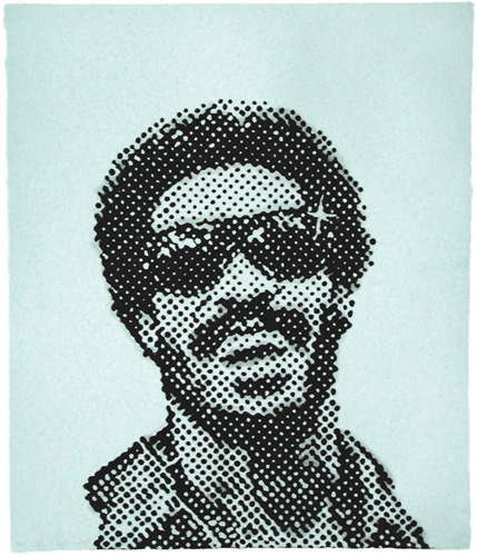
Glenn Ligon. “End of Year Reports,” 2003. Suite of eight photocopies and screenprints on pigmented abaca paper. 11 x 8 ½ in. each (sheet), edition of 10. ©Glenn Ligon, image courtesy Dieu Donné Papermill, New York.
Perhaps as a result of his 2000 Coloring series in which he collaborated with children, Ligon turned to his own childhood for source material in a body of work created at Dieu Donné Papermill from 2003-08. His first edition there, End of Year Reports (2003), reproduced his elementary school teachers’ assessments of his abilities and weaknesses, one of which ironically states, “He tends to be politically apathetic about being black, which is a shame.” Later, he created two paper-pulp multiples depicting Stevie Wonder and James Brown, titled Self-Portrait at Eleven Years Old (2004) and Self-Portrait at Nine Years Old (2008), respectively. In projecting formative moments of his own youth, Ligon inspires reflection on the experiences of the viewer’s own childhood, how these accumulate to form one’s identity, as well as how it might differ from that of others.

Glenn Ligon. “Self-Portrait at Eleven Years Old,” 2004. Cotton base sheet with stenciled pulp painting. 36 x 20 in. (sheet), edition of 20. ©Glenn Ligon, image courtesy Dieu Donné Papermill, New York.
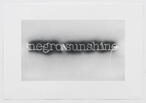
As explored in his Art in the Twenty-First Century segment, Ligon branched into neon in 2005. His first work was titled Warm Broad Glow, after Gertrude Stein’s source text, though the words read “negro sunshine.” (Ligon also treated the words “negro sunshine” with his signature stenciling approach in a series of works on paper and two 2010 etchings printed at Polígrafa Obra Gráfica.) Stein’s Three Lives, her first published work, includes a tale about a woman of mixed parentage. Though received as progressive when published, a contemporary reader will be shocked with Stein’s blatant stereotyping, in which she describes one of the characters, as “a real black” and laments, “Rose laughed when she was happy but she had not the wide, abandoned laughter that makes the warm broad glow of negro sunshine. Rose was never joyous with the earth-born, boundless joy of negroes” (Bartelby.com). The historical moment of Stein’s novella attracted Ligon to it as a subject – in his neon, Ligon conceptually links the effects of such stereotyping to the format of the work – the letters are “blacked-out” from the front (a technique usually used to separate letters), allowing the light emanating from the tubes to shine only on the wall behind. A photographic image of the neon was used for Warm Broad Glow (reversed) (2007) (illustrated top), a photogravure. However, in a clever turn, Ligon requested that the photographic negative be transcribed “as is” – effectively, a negative image of the neon. The words appear here as they might if the tubing had not been blackened on the front – behind them is an ironic black “glow.”

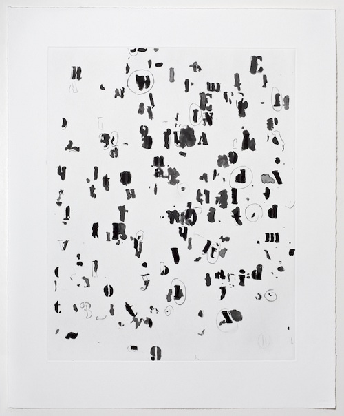
Glenn Ligon. “Draft,” 2010. Etching with aquatint, sugarlift, spitbite, and drypoint. 25 ½ x 21 in. (sheet), edition of 55. ©Glenn Ligon, image courtesy Burnet Editions, New York.
Though too soon to define with specificity, the election of President Obama has fundamentally changed the nature of race relations in the US, and this has naturally impacted Ligon’s work. His recent film The Death of Tom (2008), which is based on the 1903 film Uncle Tom’s Cabin after the famed 1851 novel (the first full-length film produced), examines a point in American history that is now, thankfully, incomprehensibly anachronistic; Ligon’s blurred and illegible film marks the passing of a reality in which it was considered revolutionary to include “colored comedians” (bit actors) in a film about African-Americans. (The DVD was issued in an edition of three with a suite of six photogravures of stills from the film – two were selected for a larger edition). Likewise, his recent neon titled Rückenfigur (2009), which conveys the word “America” with the letters flipped but reading from left to right, suggest a moment of both looking forward and backward, as indicated by the title which translates as “figure from behind,” an art history term coined to describe the work of Caspar David Friedrich. The future of the relationship between white and black Americans is still undefined, as encapsulated by Ligon in a recent etching titled Draft (2010); his customary words are scattered into separate letters, symbols, and numbers that float across an amorphous space, entirely illegible, waiting to coalesce into something new.