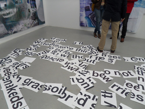
Mario Cutajar. "Dispersion (after Brecht)," installation at JB Jurve, 2011. Photo: Carol Cheh.
“From symbiosis to parasitism is a short step. The word is now a virus. The flu virus may once have been a healthy lung cell. It is now a parasitic organism that invades and damages the lungs. The word may once have been a healthy neural cell. It is now a parasitic organism that invades and damages the central nervous system. Modern man has lost the option of silence. Try halting your sub-vocal speech. Try to achieve even ten seconds of inner silence. You will encounter a resisting organism that forces you to talk. That organism is the word.”
–William S. Burroughs, from The Ticket That Exploded, 1962
In his relentless, lifelong quest to push the written word into new realms of expression, William S. Burroughs experimented with a few formal techniques, one of which was the “cut-up.” Stumbled upon by his artist friend and collaborator Brion Gysin in the process of cutting a matte, the cut-up was a splicing together of different pieces of pre-existing writing to create something new. A literary echo of surrealist collage methods, the cut-up technique freed the writer from the dictates of linear narrative and invoked a free-association mind state.
As a tribute to Burroughs, whose writing inspired the name of this column, I am launching it with a cut-up of my own. As a Los Angeles–based freelance arts writer, I generate texts on a daily basis discussing artworks that I have seen. Often I am forced to edit out sections of text for the sake of conciseness. When these discards are interesting to me, I save them as separate files called “discarded texts.” I have amassed around 30 of these over the last few years. Below I have selected some of the files and collaged them together into a new essay, whose lack of tethering to a single subject turns it into a more freeform negotiation of ideas.
*****
When approached to contribute his work to the new building, Kelly initially thought of creating one of his colorful blob pieces, to hang in the front like a medallion. But then he decided that would be too decorative, and went instead with something that would blend more closely with the architecture. Hence, the black-and-white motif, which Kelly later realized echoed a series that he did in 1961 (these works are also featured in the show, which is otherwise comprised of recent works). Marks loved the look of the facade so much, he worked with the city to have the phone lines in front of the gallery buried, so they wouldn’t obstruct the view of the building.
To draw even more attention to the absurd pantomime that is our world stage, Laser intersperses the straight dramatic scenes with more abstract interludes involving a recurring clown figure, who at one point instructs the audience on political speech writing and the techniques of the pickup artist.
In thinking about these two overblown projects, it’s more interesting to sketch out what they lack, rather than repeat the obviousness of what they do have to offer.
There are times when L.A. gets to be too much—too much congestion, too many people, too many things to do. But this was just my experience. I can easily imagine others finding the same works riveting.
The centerpiece of this project is really the Desert video. Hypnotic but also jarring in parts, it features long, lingering shots of dry desert landscape juxtaposed with odd interludes, such as footage of a motorized vehicle screaming across the plains, or an aerial shot of a dry lake bed. The rhythms seem to reflect Fleming’s changing dispositions from day to day—whether he was calm and in tune with his environs, or impatient and wanting to shake things up. By contrast, IT sees the artist back in his studio, and in complete control of his product. We watch indistinguishable shapes do a seductive dance in a classic abstraction of light and texture.
Elke Silvia Krystufek. "Christkind," acrylic on fabric, 1998. Photo: Fredrik Nilsen. Courtesy of The Box Gallery, Los Angeles.
What first struck me about Elke Silvia Krystufek’s show at The Box was the paintings—bold, distinct, but with an eccentric, unreadable edge. They made an impression on me, even though I couldn’t quite tell what they were speaking about.
MoMA’s atrium gallery, officially known as the Donald B. and Catherine C. Marron Atrium, is a dramatic spot. Centrally located on the second floor and surrounded on all sides by the rising stories that comprise this monumental museum, the atrium commands a huge column of open space with vantage points from all sides. In the midst of this museum’s constant overload of frenetic activity, the atrium successfully provides a powerful center stage.
The work was about presence and energy, and the artist giving that energy to the audience; it was going for transcendence, according to the spiritual leanings of the artist, but what it often evoked was spectacle and idol worship.
Matthew Marks Gallery, Los Angeles. Photo: Carol Cheh.
The more I think about Tirs: Reloaded—last Sunday’s tribute to and re-enactment of Niki de Saint Phalle’s infamous shooting paintings—the more profound and vexing the distance becomes between my pure visceral delight in the piece, and the sadness I feel as I consider everything that’s changed in the art world between 1962, the date of Saint Phalle’s first shooting performance in L.A., and now.
Truth be told, a non-viewable exhibition was a bold new statement in 1966, but it might seem a bit precious and contrived today; Segade’s decision opens up the conceit of the show and makes it accessible to a new audience. Being able to look at his students’ interpretation of Gregor’s instructions is not only fun, it might inspire viewers to embark on their own re-stagings.