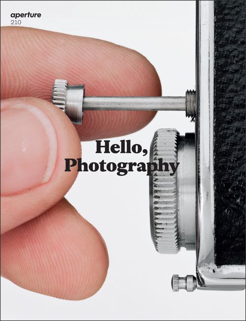
Periodicals such as Esopus, BOMB and Aperture are some of my very favorite magazines to read and teach with. Between the fantastic artist-on-artist interviews in BOMB and the magazine-as-art quality of Esopus, there is plenty to work with. In the past, I have assigned readings for students to compare, interviews for students to build on, and even specific featured artists to use as a starting point when creating works of their own. But the recent spring edition of Aperture really makes me smile.
Aperture has re-envisioned what was already a high quality magazine and made some beautiful and exciting changes. Aside from the magazine looking even better (their new art directors, A2/SW/HK, have decided to make the magazine slightly larger, expand on the number of pages and use a different coated stock), each issue will, “cohere around an inquiry into a field or topic.”
Sound familiar?
The “relaunch” of Aperture is set up around “a broad set of concerns for photography today” and introduces “a range of vital questions with a view to animating—and reanimating—key ideas on photography.” Some of the questions and topics investigated this spring include What matters now in photography? and Are institutions ready for a new wave of photographic innovation?
As an educator who has a deep interest in the fact that so many students have access to photography and the ability to take pictures, Aperture’s decision to focus future issues on questions and specific thematic topics is a welcome change to a magazine that already had my vote as one of the best periodicals for art educators to teach with.
