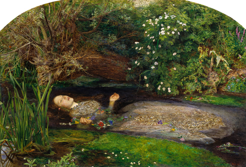
Sir John Everet Millais.“Ophelia,” 1852. Oil on canvas. 30 x 44 inches. Tate Britain Collection.
There is a line of questioning that museum professionals have been asking themselves: What exactly is happening when we look at artwork online? What is the difference between experiencing a painting on the web as opposed to in a gallery? What role does authenticity and environment play in interpretation? A trio of UK-based researchers gathered in 2011 and took a scientific approach to answering these questions. Inspired by the humanities, but looking for quantitative analysis, they set up a simple but provocative experiment to better understand the process of looking at art.
In 1852, Sir John Everet Millais completed his masterpiece Ophelia, based on the character from Shakespeare’s Hamlet. A striking portrait of life’s swan song, Ophelia is remembered for her tragic beauty. The painting itself is revered for exquisite technique and its coded patterns. Ophelia is held in Tate Britain’s permanent collection and is currently valued at over 30 million pounds, or 47.5 million US dollars.
Ophelia has long enchanted audiences. And something about it spoke to Rodrigo Quian Quiroga, Sandra Dudley, and Jennifer Binnie, the interdisciplinary researchers who decided to investigate it further. To learn the differences between the live versus the digital viewing experience, they strapped digital eye tracking devices to visitors and asked them to look at Ophelia as the researchers recorded the data. “Do we look at originals and digital images differently?” they wondered. Their results, recently published in the journal of Advances in Clinical Neuroscience & Rehabilitation, countered conventional wisdom, upending what we thought we knew.
As layered with style as it is with meaning, Ophelia was an interesting choice for the study. If you divide the painting into grids, every single one of them is densely packed with detail. In science, conventional wisdom says that audiences are drawn to the most salient or interesting sections of a painting. As I explained in my earlier post “Tracking the Gaze,” the human face, especially the eyes, are the areas where people fixate most, followed by areas containing information that will help one understand the narrative of a painting. In this rendering, Ophelia is captured at her most vulnerable yet brazen moment—singing, with a bouquet of flowers in hand, as she drowns in a brook.
Observing behavioral patterns both in the lab and at the Tate, the researchers noted some clear differences in how people were looking at this painting. Again, based on earlier studies, we should expect one’s eyes to fixate on Ophelia’s face and then wander to other parts of her body or certain areas of the background. The researchers found that this behavior held true on a screen in the lab whereas in the gallery people responded a little differently. At the Tate, visitors would approach the painting and fix upon Ophelia’s eyes and lips, but where they were most absorbed was in the space surrounding Ophelia—the background. Context piqued their curiosity. In general, the researchers found that people in the galleries not only looked closer but also dwelled upon areas that people in the lab had missed. “These contrary viewing patterns,” the study says, “show that while the participants in the lab focused on the smaller area of Ophelia, those in the Tate explored more thoroughly the original artwork, exploring the larger area around Ophelia.”
We can draw a number of conclusions from this study: One could argue that visitors are more curious in a gallery setting. That they’re more willing to go outside the bounds of what is seemingly important. Or that here the face alone does not tell the full story. What do the flowers represent? What is visible beneath the water? Is there a skull hiding in the undergrowth? (A page on the Tate website explores some of the symbols and ciphers coded in the painting.)
Beyond pictorial representations, researchers observed that visitor’s tended to study the techniques used in making the painting–brush strokes, color, texture. This trend was not observed as much in the lab. With flat, glossy screens, it’s more difficult to perceive fine details like brush strokes. Also, when you are looking at a screen, you are typically looking from a constrained distance. Galleries promote different viewing angles and distances and therefore different modes of interpretation based on your physical perspective. “Whether it is the texture and physicality of the artwork itself,” the study concluded, “the gallery environment or both that directs this wider exploration of the painting, it is clear that through the experience of the original, the viewers are looking for more than just the most salient features.”
This study looks at a narrow neurological niche in the study of art—what is the behavior of the gaze at the moment of contact? But then what is happening in the mind before and after approach? Empirical data in this study is favored over qualitative analysis. Obviously, there are some critical factors that are going to influence the experience and how one looks. The biggest question for me is what influences one’s appreciation of the artwork? Can we even study that with the tools of cognitive science?
Also missing from this study is consideration of the physical environment. Viewing strategies clearly differ, but what about the memory of the actual experience? Yes, you can provide art online, but are digital representations actually sticking in the memory? That is, how effective are they when it comes to remembering?
Exploring a gallery is a rapturous, fully immersive experience. Nearly all of the senses pique as you absorb and process the light and acoustics and even the smells around you. For me, the simple act of entering a museum space makes for an incomparable learning experience. The more associations you can feed your mind, the more neural connections to bind the memory. The more threads you weave into a knit, the stronger the fabric.
Postscript
I don’t want this piece to be interpreted as a case against online and digital imagery. I myself work in digital humanities, and truly believe that giving people access to images is essential in promoting online experiences. I might never have a chance to see Ophelia in person and to have remote access to the image is invaluable. However, I also understand the virtual and the gallery viewing experiences to be very different things. Seeing an authentic work of art in its intended setting is experientially different. And when it comes to education and lifelong learning, there is no substitute for the experience of seeing an object up close and personal. Yet digital experiences can augment and strengthen gallery experiences. They too can draw your attention to details you might never have noticed. With that, strategic integration of digital imagery in tandem with the physical can make a good experience great.
If you’d like to read the original study discussed here, a PDF is available from the ACNR Journal. Also, Tate’s page on Ophelia has some wonderful educational stories about the painting.
Pingback: Week in Review | 01.26.13 | Art21 Blog
Pingback: Brain on the Beach: Seven Essential Sources for Art and Cognitive Science | Art21 Blog
Pingback: Ouch! Hirst’s “End Game” | let's explore art