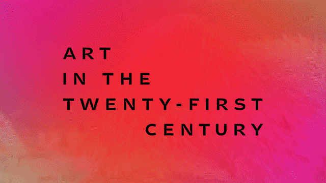
Title sequence from the Season 8 trailer. Designed by Matt Eller.
Matt Eller designs title sequences, graphic systems, short form video, and books for places like Lincoln Center Education, the Science Channel, Mercy Corp, IFC, SFMOMA, FX Networks, Showtime Network, They Might Be Giants, the Walker Art Center, and USA Network. He joined us to produce the title sequences, motion design, and typographic system for Season 8 of Art in the Twenty-First Century.
Eve Moros Ortega: Tell us a little about your background?
Matt Eller: I grew up on a farm in Iowa. I started in advertising, selling dishwashers and socks to the citizens of the Twin Cities. Then I worked as a designer at the Walker Art Center for a few years. Later I moved to Portland, Oregon for the weather, mountains, forests, ocean, urban planning, etc. It’s nice here—really nice.
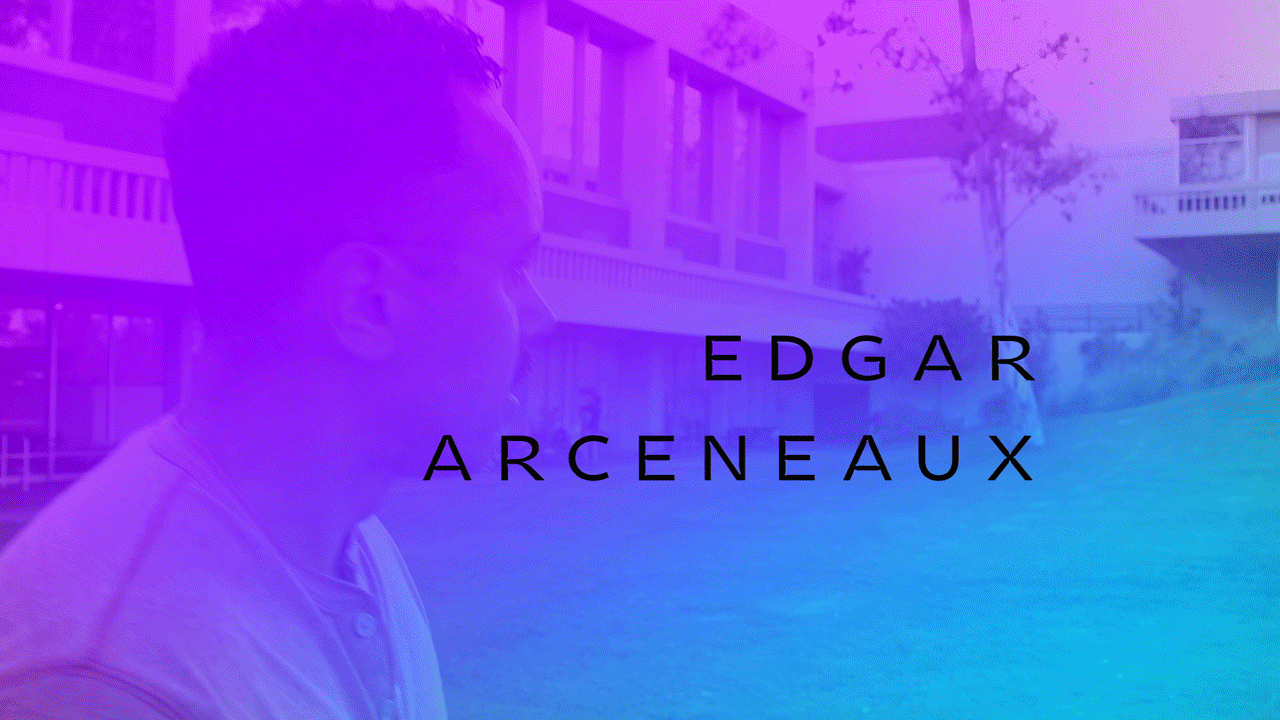
Sneak peek of Edgar Arceneaux’s title sequence in the Los Angeles episode of Art in the Twenty-First Century Season 8. Designed by Matt Eller.
EMO: What made you want to work on Art in the Twenty-First Century?
ME: It seemed like a natural fit with my previous work as the Walker’s Design Director combined with my ongoing connections to the visual arts world. My wife and most of my closest friends are artists and musicians, or otherwise involved in the arts. It also seemed like a great project to work on with my composer pal Joel Pickard, whose sensibilities aligned perfectly with the project.
EMO: What was most challenging about working on Season 8?
ME: There were a lot of moving parts—finding the relationships between many disparate elements and getting them to work together in a way that made sense and did justice to the artists. Striving to find the right balance of expressive storytelling and typographic clarity. It’s always a challenge.
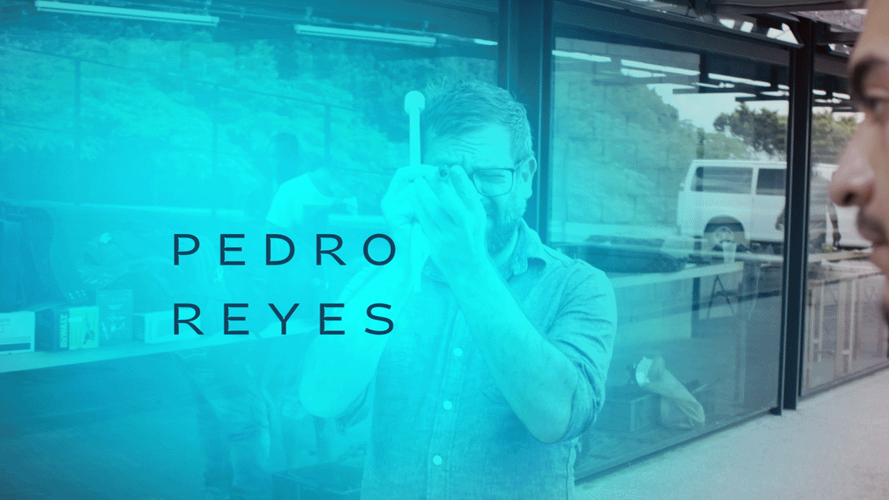
Sneak peek of Pedro Reyes’ title sequence in the Mexico City episode of Art in the Twenty-First Century Season 8. Designed by Matt Eller.
EMO: Which part of Season 8 are you most proud of?
ME: Pulling it altogether! Especially though, that I was the editor on the individual show opens and the trailer, in addition to directing the motion theory and typography. I feel really good about the results and hope to do more. Joel and I did a lot of back-and-forthing between his audio cues and my edit points. It’s nothing without the audio tracks. I also really like the way the shows flow organically into and out of the graphics-heavy sections, instead of them being abruptly different pieces.
EMO: What were the most interesting things you learned?
ME: I was unfamiliar with a couple of the artists in the season. It was great to be exposed to some new amazing art/artists.
Pingback: What Do Cities Sound Like? An Interview with Season 8 Composer Joel Pickard | ART21 Magazine
Pingback: This Week in Art: 9.5-9.11 | ART21 Magazine