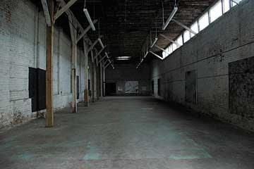
Roughly located between New Orleans’ Business and Garden Districts, the Warehouse Arts District was a major concentrations for Prospect.1 displays. Dominated by warehouses and old industrial spaces, there is little of the ornamental architecture that gives the rest of New Orleans its distinct flavor.
While there were a few works scattered in warehouse and neighborhood non-profit spaces, the vast majority of art was on display at the city’s Contemporary Arts Center (CAC) which is located near many of the city’s other museums, including the World War II Museum, the Children’s Museum, the Civil War Museum and the Ogden Museum of Southern Art.
A modern and spacious building, the CAC was expertly curated with dozens of works that felt like a biennial in and of themselves. The Warehouse District may have been a starting point for many biennial visitors but I chose to end my posts with a jaunt through this post-industrial neighborhood.
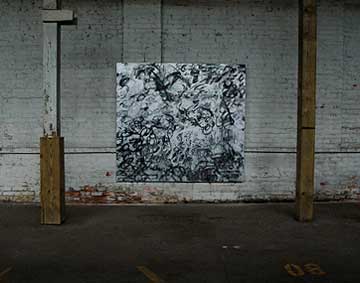
Jacqueline Humphries, installation view at Ideal Auto Repair; work on the bottom: Soft Machine (2008)
Born in New Orleans, Humphries chose a site that evoked the fact that her family once owned a auto repair shop. Using auto enamel and oil, she created five large gestural works that came alive in this naturally lit space full of grays, browns and dirty whites. The metallic pigments seemed to absorb the subtle light and I could’ve stayed for hours to watch how the light created subtle changes in the work. There was also a curious backroom to this exhibition which included picket-like forms painted in the same manner as the larger works. They were unidentified and posted in a dark room. I could only guess they were studies for the larger panels.
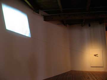
Robin Rhode, Kite (2008) at CAC
One of the funniest and most poetic works in the biennial, Rhode’s work included a video component (which is hard to identify in the photograph) that displayed the sky behind the imaginary kite. Hands on another canvas held the kite into place. The work creates a mood of nostalgia and loss. Place in a darkened corner of the museum, you sense you are experiencing a very private and intimate moment.
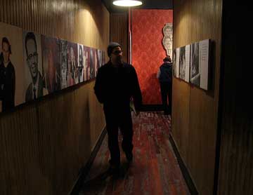
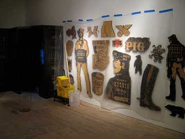
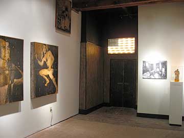
Skylar Fein, Remember the UpStairs Lounge (2008) at the CAC
Fein’s installation was a tribute to a sad moment in LGBT history in New Orleans. Long an oasis of tolerance for LGBT Americans in a region not always so welcoming to sexual diversity, UpStairs Lounge was a meeting place for gay men until it was destroyed by arson on June 24, 1973. Fein’s work chronicles the largely forgotten event, which was the largest mass murder of LGBT Americans in history (32 people dead). His installation memorializes this tragedy while excavating some of the excitement and underground glamor that was part of the experience of its patrons.
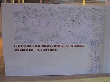
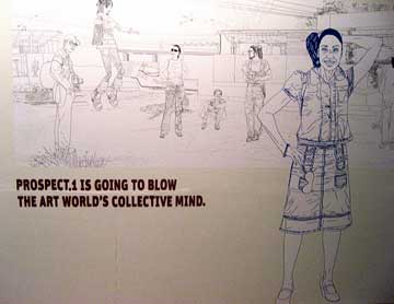
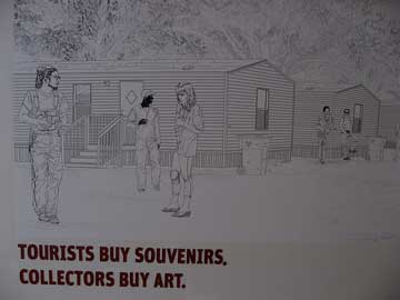
Cao Fei (SL:China Tracy) + Map Office (Gutierrez + Portefaix), No Lab (2008) at CAC
There was a central Second Life component to the Cao Fei piece but I found the billboard-like panels on the outside of the platform construction to be really fascinating. Combining pop culture references with shocking information, the large works were forms of hybrid advertisements attempting to sell us a notion of Prospect.1 and New Orleans that was a cocktail of fact and PR fiction.
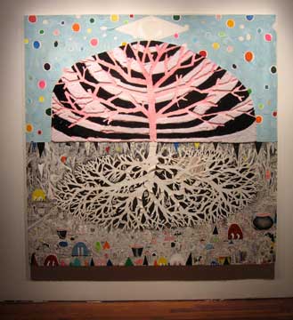
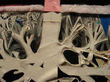
Trenton Doyle Hancock, The Dual Nature of a Spirit’s Wager (2007) at the CAC
Hancock’s vibrant paintings are always warm and friendly. Each work feels like a universe in and of itself and his art practice combines a strong palette with elements of folk art, childhood craft and deeply spiritual imagery steeped in the fantastic and monumental. In this panel, day and night, reflected in the same tree, represent an allegory of good and evil.
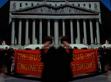
Josephine Meckseper, 0% Down (2008) at CAC
This was my first exposure to Meckseper’s work, but this video was mesmerizing and profound in light of the global economic meltdown. By mirroring the images she seemed to emphasize that she was only reflecting our culture and its absurd fascinations.
)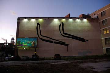
Arturo Herrera, Untitled (2008)
Herrera’s large wall work was curiously placed on a wall with a billboard that made me wonder if I was looking at street art or a biennial work, since it seemed to compete with the advertisement. Partly of the work was already falling off the wall and while the forms were grand and sweeping, their placement made them feel unintentional.
Some Closing Thoughts…
I have to admit that I was quite amazed that four days was not enough time to accomplish my mission of seeing all the art at Prospect.1. By my calculations, I was able to see roughly 95% of the art on display and I should also mention that there were a great many works I encountered that I wasn’t able to discuss in my five posts here. For those who may be interested, I have posted an archive of most of what I saw here.
If I had to summarize the biennial, I would say that it was one of the most incredible ways to discover a city’s hidden treasures and quickly feel part of the fabric of a place. The works were diverse, ambitious, lively, and sometimes difficult, but always engaging.

