Back in 2004, I was lucky enough to be introduced to Esopus magazine at a silent auction being held during a Mass MoCA fundraiser. Don’t ask me how, but my wife and I were able to bid on (and somehow afford when we won) a package that included a signed copy by every single artist and author in the very first issue of Esopus. At the time, I wasn’t as familiar with Beth Campbell or Christopher Durang, but I immediately loved their contributions. I was intrigued by the Richard Tuttle piece and had no idea what to make of Alex Shear’s work. And these were just four of the contributors!
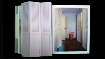
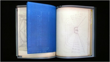
Since then, I have managed to devour every issue at a leisurely pace (Esopus is published twice a year), been introduced to many new artists, and reintroduced to artists and writers I thought I knew. I have found ways to utilize Esopus as a teaching resource in the classroom and have shared it with many colleagues who have been impressed with the way the magazine simultaneously feels like a periodical and a group exhibit you hold in your hands.
This week, Teaching with Contemporary Art is pleased to present part one of an interview with Esopus editor, Tod Lippy, conducted via e-mail over the past month:
Joe Fusaro: What’s the story behind Esopus magazine? It’s certainly not a “regular” art magazine. As a matter of fact it’s more like a work of art that operates in a magazine-format and schedule. How did you get started?
Tod Lippy: I founded Esopus in 2003. I started it mainly because I had had a fair amount of experience in editing special-interest magazines and I wanted to take a different approach in order to create a magazine that would reach a wider audience. The idea was to come up with something that was very multidisciplinary in form and content. We have contributions from contemporary artists and filmmakers, writers, poets, musicians – a CD is included in every issue – and the idea was to avoid the kind of ghettoization that often comes with specialization in creative disciplines. If you go to a Barnes and Noble newsstand, you’ll find an Art section, and a Literature section, and a Film section, and a Design section—the idea was to somehow incorporate all of these in one magazine in order to attract a broader readership. There were several other ideas behind the founding of the magazine, but probably the most important one was that I didn’t want to include any advertising. I feel like I’m constantly fighting with advertisers when I’m going through my favorite magazines—particularly these days, when editorial and advertising are so hard to distinguish from one another—and it seemed like it was worth a shot to try to do a magazine that literally had nothing in it that was for sale. So, in order to do that, I created a non-profit entity, the Esopus Foundation Ltd. We’re a 501(c)(3) and we depend on contributions from foundations and individuals to make up for the money we lose from not being able to count on advertising revenue which, as you probably know, is very important in the magazine publishing world.
JF: Did you also set out to create a magazine which functions as a work of art in itself? Because of the interdisciplinary nature of Esopus it also feels like purchasing a piece of art. There are things to unfold, pull out, and listen to.
TL: I can’t say that I explicitly set out to make something that functioned like a work of art. I think that was probably a natural offshoot of my wanting to stay as invisible as possible as a designer. Most magazines have a very rigorous grid structure — an extreme example of this would be, say The New Yorker — where every article fits into a very recognizable format: Columns are generally the same width, headline and body typefaces are consistent, and artwork tends to be “framed” in relation to the composition of the page. I actually love The New Yorker and its look but that’s not what I was going for with Esopus. I wanted everything that appeared in the magazine to work visually on its own particular terms rather than conforming to a “house style” — that way, I hoped, each article or project would feel less mediated, and this would provide a more authentic experience for our readers. The idea was to give them the sense that they were flipping through a box of artifacts, each slightly different from the one before it. This approach, I think, encourages that interaction you mentioned, which is so important to me and to the mission of the magazine. The less passive our audience feels, the better (for them and us)!
JF: Describe some of the challenges you face as you design and organize each issue.
TL: One of the biggest challenges is gathering content — each issue usually contains approximately 25 contributors (split between musicians for the CD and artists, writers, etc. for the magazine), and securing contributions from, and then keeping in contact with, all of these (typically very busy) people can present its difficulties. Usually I will start an issue with three or four definite contributions, and from there, it becomes easier and easier to fill in the blanks for the rest. For instance, if two artists are contributing artists’ projects and they both happen to be, say, photographers, I will obviously seek out a third who can contribute drawings or paintings. As the issue comes together, some semblance of a theme usually emerges. Although I don’t use it to identify the issue in any kind of formal way (our issues aren’t themed; only the CD is), it does tend to help the whole project coalesce in my mind. After editing, the design of the issue is the last thing I do before the magazine goes to press. As I mentioned before, in many cases it’s simply a matter of taking whatever an artist has given me and placing it in the magazine as is; at other times, there is more give-and-take between the contributor and myself. The key to all of this is a direct relationship between the two of us — one of my golden rules is that I never deal with people through their handlers (agents, publicists, gallerists, etc.), as it tends to lead to misunderstanding, confusion, and worse. So I will go back and forth with each contributor until they are happy with their piece Everyone always gets a chance to approve a final layout before we go to press. This whole process usually takes about 4 months.
Of course the other challenge — always — is financial. And that involves not only fundraising and creative thinking to cut costs but also aggressively seeking in-kind donations from paper companies, suppliers, and service people.
Part two of this interview will be published next week in the Teaching with Contemporary Art column.


Pingback: What’s Cookin at the Art21 Blog: A Weekly Index | Art21 Blog