Los Angeles galleries are brimming with minimal, kind-of-conceptual abstraction at the moment — Paul Davis’s successions of hinges and wood and Joe Fyfe’s felt and muslin Motherwell spin-offs at ACME; Matt Connors’s posed expressionism and empty frames at Cherry and Martin; Leonor Antunes‘s hanging brass triangles at Marc Foxx; or Lisa Williamson’s controlled outlines and understated installations at the recently closed David Kordansky exhibition. But of all these, it’s veteran Mel Bochner who makes the keenest impression.
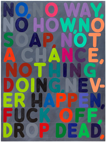
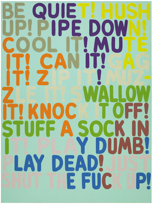
Mel Bochner is obscenely smart. He has the pedigree and, when he wants to, the vocabulary of an academic. He has taught at the New School and Yale, and written about the “oddly circular history” of perspective and linguistics in Wittgenstein. But through forty-five years of making, he’s managed to keep his artwork visually crass, provocatively simplistic, and, as a result, wittily incisive. In his current exhibition at Marc Selywn Fine Art, a series of comfortably large, kinkily colored paintings run through sequences of synonyms. Visually staccato, the paintings look the way that Charles Bukowski soundbytes sound.
Bochner, who has called himself a “belated beatnik,” had his first exhibition back in 1966, at the School of Visual Arts in New York City. Then, like now, he was questioning the grammar of art. In a particularly memorable piece, he used word portraits to engage work made by his contemporaries–in Portrait of Eva Hesse, a slew of tactile-sounding verbs circle around the word “wrap,” which anchors the drawing. It’s an abstraction of an abstraction that pulls Hesse’s ideas out of the context of her work and yet it’s surprisingly accessible. Pared down to “wrap,” “limit,” “ensconce,” and “tie-up,” among other words, Hesse (or at least the Hesse represented by these verbs) seems like a spatially-obsessed poet who’s fixated on everything bodily, which is actually fairly accurate.
Since then, Bochner has done a variety of public works, written about Donal Judd and serialization for Artforum and, among other ventures, begun a refreshingly whimsical series of drawing not too ingeniously derived from Roget’s Thesaurus.
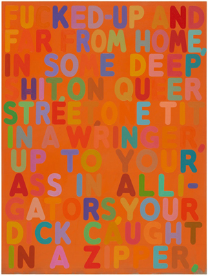
A new wave of thesaurus paintings is on view at Marc Selwyn. These paintings, all of which have palettes that could have popped off Sunday school felt boards, are evenly populated with rounded, multi-colored letters (excepting articles, only a few words consist of just one color: “hush,” “tits,” “stuff,” “skin,” “sofa, “rich,” and “dead”). A term in the top left-hand corner always starts off the progression. Then a string of synonyms follow. Upon first reading, the synonyms seem absurd, and, after a closer read, they still seem absurd. Can you really move from “lazy,” to “torpid,” to “lumpen,” to “proletariat”? If so, it explains that illegible genre of undergraduate writing in which, afraid of using any word more than once, students offer up mouthfuls of synonym-speckled sentences.
One of Bochner’s paintings, titled Fucked-Up, feels more like prose poetry that could have inspired Denis Johnson’s Jesus’ Son than a progression of terms. It has a bold orange ground and just enough pleasingly placed, complimentary blue letters set up against almost-too-many orange-yellow letters that disappear against the background. The painting reads, “Fucked-up And/Far From Home,/In Some Deep/Shit, On Queer Street, One Tit/In A Wringer,/Up To Your/Ass In Alli-/gators, Your/Dick Caught In A Zipper.”
According to his student and fan Chuck Palahniuk, writer Tom Spanbauer uses the metaphor of a horse when he teaches minimalism:
“The first thing you study is what Tom calls ‘horses.’ The metaphor is–if you drive a wagon from Utah to California, you use the same horses the whole way. Substitute the word “themes” . . . and you get the idea. . . . The next aspect, Spanbauer calls ‘burnt tongue.’ A way of saying something, but saying it wrong, twisting it to slow down the reader.”
This approach is funny, because it suggests that tightly controlled consistency, coupled with an calculated element of surprise, is what allows language to work effectively on a reader. It’s also funny because it might be true.
Bochner works in the realm of one-horsed wagons and burnt tongues. He has a single vehicle–pithy, clear-cut terms and symbols–which, presented in a slightly unexpected, heavily visual way, have allowed him to drive through forty-plus years of art history and make a point that is starkly straightforward: language isn’t transparent and, if it ever brings you to meaning, it takes a lot of detours on the way.


Pingback: What’s Cookin at the Art21 Blog: A Weekly Index | Art21 Blog
Pingback: Colors, Concepts and Typography in Mel Bochner’s Fine Art | REAL ESTATE ARTS