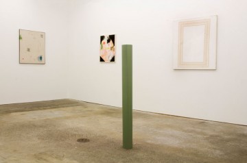
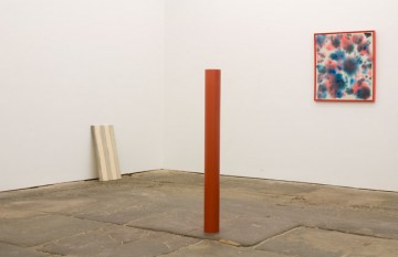
Striped bathroom wallpaper, Cy Twombly, Imi Knoebel, and scribbles resembling Pop-like lineaments or cave markings are all evoked by Matt Connors work in his current exhibition at Canada Gallery. Red and green pillars of solid color, made from digital C-prints, stand like abstract Photoshop totems to Color Field painting. Neon splashes cover one canvas while another contains three beige, geometric rectangles. Colors, although never clashing on a single canvas, vary dramatically from brash to soft pastels throughout, as do the abstract influences that Connors depicts. One canvas resembles the frame of a painting, and the next echoes a chaotic, colorful Matisse collage. Tropical contains juxtapositions within the work itself: a brightly colored image has been overpainted by a layer of white that almost covers the surface but the edges have been left exposed so the vibrancy peeks out from behind. Another work, Tunnel, conjures a three-dimensional image through the title but consists of two colorful rectangles (one within the other) framing a brown Kenneth Noland-like bullseye that instead appears flat against the canvas. Connors refuses to stick with just one abstract model and repeatedly plays with overlooked gestures such as the doodle-like markings. It is as though he has selected sections of various Modernist works, examined them closely and then made them his own.
As with Connors’ earlier work, frames are a crucial element — not only do pieces resemble the frame of a painting but some of the canvases actually have a frame or give the effect of having one with a white or unpainted border. The word ‘frame’ is included in the titles of three of the paintings and framing the display of the works is also something he continues to question: paintings are not necessarily hung on the walls, some lean against the wall on the floor.
Although referring outwardly to other Modernist artists, the frame reigns the work back in towards Connors’ own abstract markings. When thinking about the paintings in this context, however, it is hard not to view the framing as forcing the artwork within a bound structure. Like a period at the end of a sentence, it is as if the frame constrains the scribbles, splotches, and lines, restricting them from breaking out of the canvas. The pieces are now decidedly complete and Connors seems to want to obstruct any further dialogue between the works. It also becomes easy to question whether this overemphasis on the frame is too much of an attempt to reinforce the authority of the paintings.
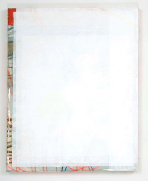
Matt Connors, "Tropical," 2010. Acrylic, oil and colored pencil on canvas, 24 7/8 x 20 in. Courtesy the artist and Canada Gallery.
Despite this definitive individuating, however, we can’t help but try to make associations between the pieces. What’s more, the digital C-print (from a documentary of a 1970s protest) and the title of the exhibition, You Don’t Know, is almost a challenge to the viewer, challenging us to figure out what exactly it is that we do not know. Jumping from one abstraction to the next feels like flicking between TV channels and, as Connors prevents correlations from threading between these pieces, we venture to find our own.


Pingback: Gallery Beige Geometric Wallpaper