I hesitate to say that exactly one person replied to the wall label writing contest, and one to the Mad Lib. I could wonder about flaws in the design of the experiment or give a P.E. class pep talk on needing to be “in it to win it.” Instead, here they are:
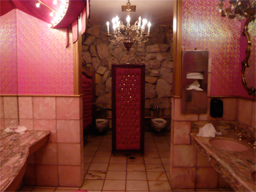
1. As submitted by one of my more gracious Southern friends, a brilliant writer and party hostess, pen name Franny Davenport:
“Marie Antoinette Takes A Dump”
Interior by Dorothy Draper, 1968
marble, linoleum, leather, gilt, porcelain
Private residence of Larry Flynt
A classic example of Dorothy Draper’s Modern Baroque style.
2. As submitted by Art21 reader Amber Harper-Slaboszewicz:
John Smith’s work has always been interested in geography. Operating at the forefront of the Duende-ist movement, he became fascinated with bottles, striving to reinvent our very concept of freedom. His sumptuous, burly brushstrokes evoke Albuquerque in the 1980‘s. Although Clement Greenberg wrote that his work was utter drivel, mountain bikers have been moved enough by his reconception of touch and semantics that they rhyme.
In this painting Nelson Mandela sits in a quiet chair looking at the viewer glibly. Over his/her shoulder looms a beagle peering at him ferociously.
Well done, Amber and Franny!
If you still want to try on your own, here is the full Mad Lib:
John Smith’s [or make up a name] work has always been interested in ___________[noun-subject matter, e.g., astronomy, home economics]. Operating at the forefront of the _______[noun-optional: in a foreign language or proper noun]-ist movement, he became fascinated with _______[noun-everyday object], striving to reinvent our very concept of _________[noun-category or platonic ideal]. His sumptuous, _______ [adjective] brushstrokes evoke __________[noun-geographic location] in the ______[decade, e.g., 1960]’s. Although Clement Greenberg wrote that his work was utter drivel, _________[noun-group of people, e.g., tourists, schoolchildren] have been moved enough by his reconception of __________[noun-category of sensory perception] and _________ [noun-field of philosophy] that they _________[verb-something that activists do].
In this painting ______ [noun-person] sits in a ________[adjective] chair looking at the viewer _________[adverb-describes facial expression]. Over his/her shoulder looms a ______ [noun-animal] peering at him _______ [adverb].
And here are reprints of the two other pictures for wall labels:
“Santa of the Grass” (I pulled the car over in California to take this):
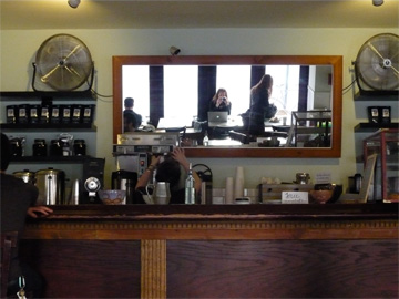
And, a cafe in Philadelphia I thought looked like a modern version of Manet’s A Bar at the Folies Bergère:
Please leave any responses–wall labels, Mad Libs, etc.–in the comments below. I also welcome suggestions for:
- one more summation sentence to the wall label, or
- an image that goes with Amber’s label above
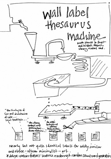
Shortly after I put up the wall label contest, I went to a group exhibition in New York. The gallery guide had an ambiguous starting point, “clockwise from the left” (whose left, starting where?). I turned to my friend to say how much I enjoyed one video installation. She agreed — except she started reading off a different summary for the work. The descriptions were entirely interchangeable. . . .
Following from Sol LeWitt’s “the idea is the machine that makes the work,” sometimes the wall label is the art that makes the work too.
To close, here is what Greg Albers, my publisher, wrote that kicked off this contest. Called “Labels Without Walls,” it is about his forays into the field of digital publishing:
In 1949, French author and statesman André Malraux wrote one of the seminal works of art history, Museum Without Walls. In it, he argued that current photographic reproduction and printing technologies allowed a new kind of art historical thought. By being able to effectively and creatively assemble images of artworks in a book, scholars could eliminate the physical limitations and decontextualizations normally imposed on art viewing by geography, economy, culture and form.
Malraux’s text is oft cited, but is also frequently over-distilled to a one-dimensional raison d’être for reproductions, monographs, catalogues and the like. This is, however, antithetical to Malraux’s actual belief. As he states in the book: “the color reproduction does not compete with the masterpiece, it merely evokes it, and rather enlarges our knowledge than satisfies our contemplation.” Malraux’s purpose was not for us to abandon the museum altogether, but to grant us the freedom to explore works of art and their connections in a more holistic way than the space of a museum gallery could then afford. The direct experience with the object remained without substitute.
Just as yesterday’s publishing technologies (photographic reproductions and offset printing) allowed Malraux to build his museum without walls, today’s publishing technologies (electronic texts and mobile capabilities) will allow us to bring that same conceptual and intellectual freedom back into the gallery space.
The average museum experience today involves singular works of art placed a few feet apart, given an overarching context by being in a thematic gallery or special exhibition, and identified and partially explained with a wall label. The wall label: Title, artist, date, materials, one or two paragraphs of text on some aspect of the work. Visitors glance at them, squint at them, bend down and puzzle over them, looking to make sense of the work. Is it famous? Is it important? What am I supposed to think? I kind of like it, why? I kind of hate it, why? Bad labels give us nothing; good labels give us answers to our questions; great labels get us to ask more. And now, if we ask more, we can get more, immediately.
When wall labels can transcend the limitations of their space and setting—just as Malraux’s images transcended theirs—their surface becomes just a teaser for the enormous world of text, images, further inspiration and education behind them.
Postscript: The picture for Franny’s winning label above is the lavatory at The Madonna Inn.

