When I initially saw the promotional poster for File Type, currently on view at University of Illinois at Chicago’s Gallery 400, I was immediately intrigued by the curatorial premise posed by curators Chaz Evans and Lorelei Stewart regarding how “formats… represent ways that artwork in digital or Internet media create particular standards of representation” (quoted from the curatorial statement). The variety of artists selected for the exhibition — a combination of local, national, and international makers – would have given me enough reason by itself for me to attend the opening. As I entered the space and browsed the works on display, I felt my curiosity continue in ways that I had not expected when initially considering the above statement by Evans and Stewart. Even after I left the show, questions kept reappearing and presenting themselves to me with intense frequency. Initially, I couldn’t help but question why some works were displayed on flat panel monitors as opposed to computer screens and as I continued to peruse the show, I wondered how the mounting of a physical show reflecting on the effects of network technology on artistic inquiry inevitably varies from a digital exhibition of identical material (something that perhaps I have had more comfort in discussing as of late). Can an exhibition highlight recursive dialogues between the language of the screen and the language of the gallery? Is there a sense of irony in the idea of a file type, since a great majority of the works deal with the translation and fluidity between codecs and mediums, as opposed to the static state of objects that galleries and museums tend to support and reenforce? Without outright calling File Type a “media art show,” how does this show effect the reception of the work, or even more importantly effect my (and the viewer’s) understanding of “media art?”
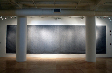
As these questions bubbled around in my brain, I decided take the initiative and voice these queries to the curators themselves. One such proposal I was unsure of regarded how the work in the show appeared to me to exist as either documentation or execution (or on rare instances, a simultaneous state) of translations of one file type to another. Christopher Meerdo‘s Cipher, the flagship piece of the show, is perhaps the best instance of what I find to be the prevalent theme I’ve described above. Meerdo’s work reinterprets the encryption of the Wikileaks “doomsday” file into binary black and white pixels that are then reprinted onto a 100 x 350-inch seamless piece of paper. I wondered how these processes of translation and migration of one format into the other specified what I observed as separation of works existing in two unique camps: exhibiting the imperfection of those conversions vs. the exhibition of a seamless or hidden transition between different formats. Although Evans and Stewart didn’t immediately think that these camps were drawn within their initial selection process, they did say that they sought to provide a variety of works containing divergent aesthetic approaches:
Chaz Evans: … if there were going to be a dichotomy, it would be between some like Casey Raes’s lush print, where we see contours which are very beautiful and which are also contrasted with the more glitch punk of Jon Cate’s skull [animation]… and there are all these different approaches [and these] are not exhaustive approaches, but just various ways.
Lorelei Stewart: Yeah, I didn’t actually think of them [the work] at two poles. I was thinking of the show having more of the glitchy stuff everywhere. Even in Kristin Lucas’s video, there are pretty little found backgrounds, and… the text elements made through mechanical turk, but… there is still some disconnect there despite what appears to be a very tight experience of the thing itself.
CE: We know there is this continuity, which is a set of images and image formats, but those images of course aren’t a seamless sequence because each image is different and discontinuous. But then they are continuous in a way because they are wrapped up into a .mov [Quicktime movie format] together.
LS: Yes, the Meerdo piece that the file is translated through its binary structure into black-and-white squares still seems like a radical shift to me.So I don’t look at it as seamless. 0s and 1’s correspond to black and white – I don’t know which one – and it is printed out end to end…That the original potent content [structured in those 0 and 1s] is now a formal physical object is such a difference of type that the result is fairly shocking.
CE: Right, and so in that sense the term seamless – which often been used as a way to describe virtual reality or completely immersive illusory works – really doesn’t occur in any of the works in this show. There is always some level where the piece is trying to expose itself, even in Casey’s work to some extent because he still wants you to notice the code, and then know there was a program, and then see there was the rendered visualization. So there is still the process which to some extent still wants to be transparent.
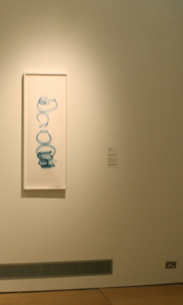
Casey Raes, "Pre-process Execution" (collaboration with Ben Fry), 2005 (.exe). Courtesy Gallery 400.
Evans pinpoints what I find to be the most thrilling part of the work selected for this exhibition through highlighting the attempts made by artists to forefront the procedures of computational and analytical translations from one format to another. In this way, I felt as though the show itself epitomized these transitions by pulling a large amount of works that usually get distributed (as well as primarily presented) in network infrastructures “file type” into the “file type” of a gallery. This desire to locate and explore the ways in which these contextual file types are speaking to one another was something that I initially couldn’t find a way to reconcile. During our conversation, I was reminded of the much disputed MTAA Simple Net Art Diagram in respect to attempting to locate the experience of an artwork within a networked conversation. In this way, the show proposed that a network can and should exist between gallery and screen, as opposed to only occurring between computers and their modems as initially proposed by the long-time net-based collaborative duo. When questioning the curators about how they viewed the show in relationship to online networks, or even as speaking to a context partial removed from its origin, they commented:
LS: On one level, I think we were always thinking about the gallery space, so thinking about work that would make sense in a physical format. But we also had conversations about making other forms of exhibition, whether that’s a disk in which people could take works home with them… or an auxiliary show in blog format that’s really just directing people to where they can see this on the net. In some ways, my first reaction is that we were always thinking about the object in the gallery, and that that experience could sustain a certain amount of screens but also needed to have some other physical objects.
CE: There were practical considerations, sure, but also you think, “What are the strategies that need to happen to take any electronic media and have it maintain some sort of appropriate context? If you take it out of “cyberspace” and put it in a physical space, you shouldn’t need to ask yourself “how,” but instead ask yourself “why.” I think being able to have the opportunity talk about the topic of file types within the context of a white cube can actually create a more intense place to evaluate that subject. Whereas if you had the same exhibition that was entirely virtual or online, the fact that the works are held within file types would be quite commonplace and wouldn’t seem all that much to consider… that displacement highlights and engages that conversation [in a more direct way]… When you take an image and you’ve converted [it] to a file format, you think, “Of course we have to do this, because technology is going this way, but also this is a ‘lesser’ version; it’s not the authentic or real-space object.” But if we foreground a work as a file type in a physical iteration, perhaps this can counteract that attitude. In general, we want to see file types as a physical and phenomenological space, in addition to being electronic or virtual. So by doing this, we hope to show things going and back and forth.
LS: I don’t know if I have a coherent answer, because I am still trying to figure that out. There are any number of possibilities of showing this work and we don’t necessarily think – although we’re happy and committed to [the] way we’ve done this show – that we’ve presented something definitive. The possibility for it to shift is something we are completely comfortable with, and we hope that the show itself can be a learning experience.
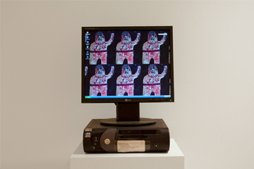
In some ways, I found it quite funny that these concerns came to me with such demanding force when presented with a physical instance of a media-heavy show like File Type – as opposed to hypothetically speculating how one could address the problems of the corporeal material of the gallery without any physical realization. As a result of the variable degree of “gallery friendly” presentations of the more digitally-based work, complex collisions of ideas occur in small pockets throughout the gallery. In one such cluster, a pedestal-mounted office-grade desktop computer by Steve Ruiz, a framed inkjet print on Hahnemühle photo rag by Casey Raes, and four digital photos mounted on foam-core by Todd Mattei and Wes Kline were all facing each other. While the entire show contained placards stipulating the file types and codecs used in each work as a supplement to the typical material listing, this room in particular struck me as having radically divergent standards for public presentation. I asked Evans and Stewart to talk to me about these decisions and to give me perspective on how certain objects were organized and arranged as they were:
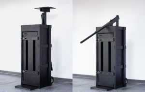
CE: The intention [with this room, and specifically Ruiz’s and Cates’s work] is that we are transgressing what you’re supposed to be doing in a white-cube gallery. I was gunning for the black cart and old crappy black CRT monitor in Jon [Cates]‘s piece, because I knew it would really resonate with a lot of stuff that he does. Since the glitchiness and the darkness of the image was a specifically easy way of establishing those visual relationships. But this goes along with the kind of transparency of the technology that we talked about and how this was really important to this specific practice of the glitch artists, whereas with Constant [Dullaart], he was really interested in the hoodwink of just having a simple .gif file trick the viewer into thinking that the piece was “raised higher art object.”
LS: We definitely wanted to make the experience that one has with a computer or a screen evident in some location of the show, and these two [Cates’s and Ruiz’s pieces] seemed the right places to do that. It’s interesting because Steve [Ruiz] wanted us to use an “office-y” computer and monitor, and in Jon [Cates’s] case, it was more intuition on Chaz’s part. But Jon was really happy with that decision in the end.
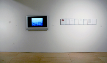
Constant Dullaart, (left to right) "File Suffix Pun" (2 .tit files, 1 .ass file and 1 .mp3), "Waving Ocean" (.gif), and "Translating Phaedrus" (.pdf). Courtesy Gallery 400.
CE: In Ruiz’s piece, he wanted to have the trappings of an office-grade piece of computer equipment because the whole collection of stuff that he and many other people have exchanged and collected over time needed to be displayed in a personal, perhaps banal way. Even though it is elevated a little bit as a sculptural object because there is a pedestal and it’s not on a desk, it still suggests that kind of computer interaction of a basic desktop and not a high-gloss, high-budget media artwork. Instead he wanted to present these everyday exchanges of looking at art through a personal computer setting.
LS: In our conversations, we were pretty excited about the presence of that very familiar type of experience in the gallery. So, in starting to imagine the gallery without these computers that maybe one could sit at engage with in that way, then I think we’d be missing something. I feel like to look at all of the other works that are removed from that experience… we wanted to have moments where the audience said, “Well, alright, I remember my own experience.” I want people to think about… their own shifting of their .jpeg into a Word document and then doing something else with it when they email it or opening it another kind of program. It’s a way of providing a self-reflective experience… necessary to the show.
Although these differing modes of presentation and experience felt inconsistent in my initial viewing of the exhibition, I can now relocate that discomfort as a lacking acknowledgment of how the experience of the screen has drastically effected my vision and mindset in the gallery. Through attempting to forsake a need to reconcile these spaces with one another, I’m left with more questions than answers about how the framework of the web effects the process of artmaking, distribution, and presentation than perhaps before I set foot in Gallery 400. But instead of finding fault in these areas of ambiguity, I’ve instead come to appreciate File Type as an investigation of how these processes of conversions and manipulations are significant considerations for both the gallery and the screen.
