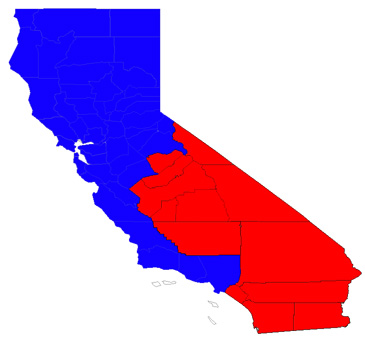
The proposed "South California." Via SFist.com.
At a meeting on Tuesday, July 12, officials in California’s Riverside County decided seceding from the rest of the state might not be such a good idea after all. The possibility of secession has bounced around in recent weeks, mostly thanks to Riverside Republican Jeff Stone, who wants to liberate counties south of Sacramento from the capital’s fiscal dysfunction. In the division Stone and party proposed, most of SoCal would be red, with the exception of the one blue strip of Los Angeles. L.A. is just as annoyingly liberal (as evidence, Stone cited the county’s recent outlawing of plastic grocery bags) and as municipally messy as Sacramento. So it had to be excluded.
Secession plans like these have been nixed before, hundreds of times—since California’s beginning, state-splitting has frequently seemed an alluring solution to fiscal and cultural complications. But it’s already a free country, right? Why not just move someplace more to your liking? An aid to Governor Jerry Brown pointed out that for anyone who badly wants to live in a red state, “there’s a place called Arizona” nearby.
The red versus blue distinction is a relatively new one. Or, at least, it hasn’t been fixed all that long. It used to be, in electoral maps of presidential elections, the incumbent took on blue, while the challenger took on the more agitated red. This changed in 2000, when states Bush won in his race against Al Gore—who, as Clinton’s former VP, was the closest thing to an incumbent—were portrayed as red. The color caught on, and Bush stayed red in 2004. By 2008, the “red Republican,” “blue Democrat” image had become so entrenched that Obama’s winnings were colored blue. Maybe this newly tightened tie to the color red has enhanced the perceptions of the right, not as stick-in-the-mud traditionalists, but recalcitrant crazies.
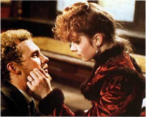
Still from "Tess," Dir. Roman Polanski, 1979.
That said, red’s fiery connotations may be overrated. Last weekend, I watched Roman Polanski’s 1979 filmTess, the first feature the director made after fleeing SoCal’s then already dysfunctional justice system (to be fair, he was fleeing statutory rape charges as well). Like the Thomas Hardy novel that inspired it, Tess tells of a young girl who resists the older, richer employer who seduced her once and wants to possess her forever. No red appears on screen until the final act.
While still fighting her predator, Tess wears white or earth-tones. But after she gives way to the kept woman role—which turns the plot in a trashier direction involving murder and a romantic get away—she’s dressed in deep red. It might seem obvious, said costume designer Anthony Powell, but it’s the red people remember years after they’ve seen the film. And the color doesn’t scream whore or symbolize shame. It’s conventional connotations emphasize how wholly Tess has been beaten down and swallowed up by powers that be.
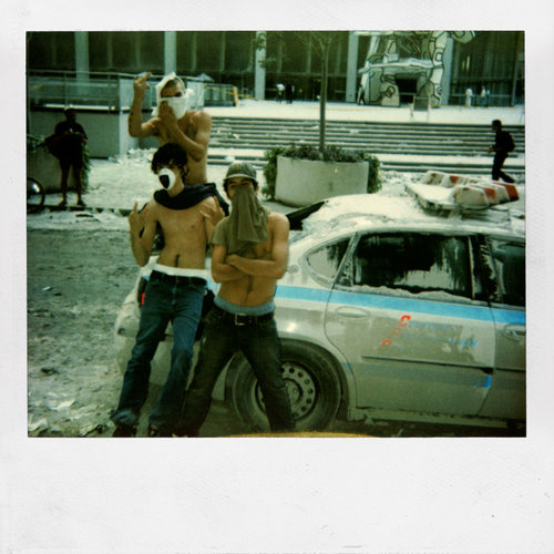
Dash Snow, 2001.
Red was my preoccupation as I gallery-hopped this week. The color didn’t appear as often as you’d expect. I saw next to none at OHWOW, a new space in West Hollywood with a new exhibition called Post 9/11. The show features work by those youth culture phenoms, Dash Snow, Ryan McGinley and crew, and includes that dickish photograph Snow took, of his shirtless friends in the ash after the twin towers fell. The only red appears in a popped balloon at the center of Dan Colen’s tar and feathered canvas, an American flag spin-off by Aaron Young and a photo of puke by Snow. In other words: if you want red, you’ve got to search.
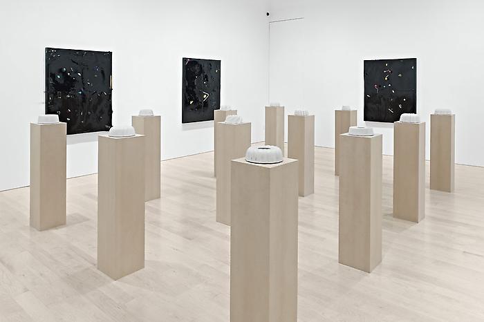
"Piero Golia: Concrete Cakes and Constellation Paintings," installation view. Courtesy Gagosian Gallery, Beverly Hills. Photo: Douglas M. Parker Studio.
In the two shows at Gagosian Gallery’s Beverly Hills space, there’s barely any red, either. Piero Golia’s cakes, cold molds of bundts made of concrete, are devoid of color altogether, and the debris-covered garish paintings hung behind have just a few red lollipops sticking out of them. Downstairs, Roe Ethridge’s photographs straddle that now-familiar space between “commerce” and “art.” In them, you’ll find dark orange and some nearly-crimson pink, but straight crimson is hard to come by.
All these artists—Ethridge, Golia and the post-9/11 crowd—likely vote blue, but it would be absurd to think their redlessness has to do with partisanship. I suspect it mostly has to do with immediacy. They’re sidestepping any pointed stance in favor of channeling what life feels like right now. Life feels indeterminate, apparently, which makes any primary color beside the point.
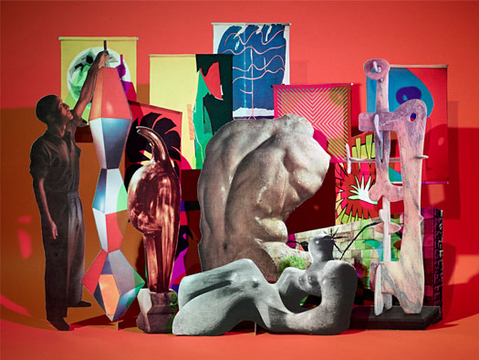
Matt Lipps, "Untitled (Form)," 2010. C-Print, 40 x 53 inches, Edition of 5 + 2 AP. Courtesy Marc Selwyn Fine Art.
The only deep red I saw art viewing this week was in work by San Francisco based photographer Matt Lipps. Hung at Marc Selwyn Fine Art, his photos are framed, retro reconfigurations of historical objects and images. Cut-out pictures of mid-century modern furniture, architecture, tapestry, sculpture, icons, and divas have been arranged together like paper-dolls. Expanses of red surround two of the most indulgently ornamental of these compositions. Because it’s clearly a design decision, the red makes these images defiantly traditional.
In fact, red in general feels unapologetically staid, a color with symbolism (from The Scarlet Letter to the stop sign) so set it’s become cliche–and conservative. But this may make it exactly the wrong color for a party eager to embrace grassroots radicalism.