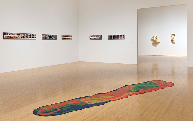
L: Carl Andre, "Eighth Reversed Steel Corner," 1978, 36 parts, steel; Photo: Krzysztof Zieliński/European Art Projects. R: Lynda Benglis, "For Carl Andre," 1970, pigmented polyurethane foam.
Once, when artists Liam Gillick and Sarah Morris had legendary minimalist Carl Andre over for dinner, Andre drank a bit much and let his tongue loose. To Morris, he said, “The trouble with people like you is you only care about skirt lengths.” It sounded sexist and perhaps was, though he meant that hers and other younger artists’ tastes vary season to season; like a slightly shorter hemline, a smaller painting might be in vogue one year, then out the next. Morris’s response? “Well, that must be nice for you, because your lasting contribution to history has been kitchen design.” [1]
Andre’s zinc and magnesium squares or his stone blocks that stand in a corner would be perfectly suited to any highly modern kitchen. Those calculated, austere spaces, like the best modern, marble-countered bathrooms, seem bent on negating the fact that they exist to service a basic bodily function.
When sculptor Lynda Benglis made For Carl Andre in 1970, she exploded his cool gray kitchen design aesthetic into an aggressive mound of silver-toned polyurethane. It was this piece, not that more notorious 1974 Artforum ad, where she wields a double-headed dildo and taunts the camera, that first convinced me of Benglis’s brilliance. It was imperturbably muscular, yet, not the least bit flabby or weak-kneed, it still managed to acknowledge that people move through the world in bodies and are as emotive and susceptible as they are cerebral.
The Lynda Benglis retrospective that began at the Irish Museum of Modern Art in 2009, then moved to Dijon, Rhode Island, and New York, finally made it to MOCA Los Angeles two weeks ago. It’s the first big Benglis museum show to come to this city, a place the artist lived and taught (at Cal Arts) on and off throughout the 1970s. It includes a number of Benglis’s floor pours, long stretches of Day-Glo color, slightly yellowed now, running out across the floor, and two of Benglis’s globular corner pieces, colored or silver mounds that, like For Carl Andre, were meant to fit snugly into corners. Perhaps due to effects of time and to the fact that they simply weren’t made for the corners they now occupy, these sculptures sit slightly forward, leaving a gap between them and the wall. This little bit of separation somehow lessens their punch, making you too aware of them as objects that have aged and traveled.
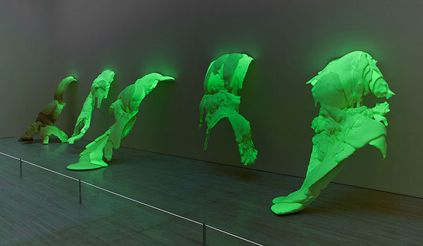
Other punches get pulled throughout the exhibition, too. There’s the uncharacteristic William Leavitt-like installation Primary Structures, made up of blue velvet and little figures that cuts across a main gallery, distracting from the more compelling corner pour and twisty metal wall sculptures on the other side. And the phosphorescent, green-glowing polyurethane stalagmites, which understandably have to be in the dark, are set off behind black curtains in a way that makes them feel like a cross between a special effects display at Universal Studios and a geological wonder replicated by a natural history museum.
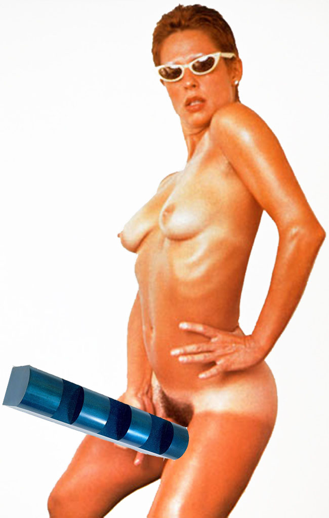
The best choice MOCA made, however, was to put Benglis’s divisive Artforum ad and the photo Annie Leibovitz took of the artist, pants down, from behind, in a separate room. Smart, stinging jokes that got at the gendered prejudices of the art world, they caused controversy, especially the ad. Artist-critic Jeremy Gilbert-Rolfe called it “flabby-opportunism” and Rosalind Krauss resigned from Artforum. Historian Marin Ries appreciated the artist’s “mammary glands…” but felt “her cock is too big.” Another artist-critic, Peter Plagens, recommended that those offended cover “the offensive anatomy with a small Don Judd inset.”
All these things could have been better said of Benglis’s main project, though: her sculptures that opened up steely, strong, self-controlled and calculated minimalism to the threat of bodiliness. Her spin-offs on male counterparts (like Andre) veer close to “flabby-opportunism”–they take advantage of the reputations of their peers and they’re certainly rotund. And she has managed to work most sculptures and floor pours so that they feel like they have both “mammary glands” and too big a cock. Which is, I suppose, why the MOCA exhibition’s pulled punches seem so irksome. Benglis, with her balls and breasts and aversion to the modernist kitchen aesthetic, has the potential to punch you half-way across a city block, and I wish I’d felt that punch.
[1] Gillick, who is married to Morris, told this story when lecturing at The Modern in Fort Worth last year.


