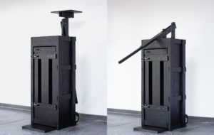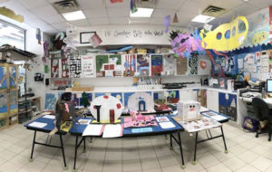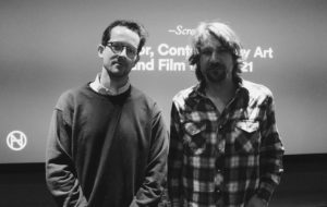
"Rethink/LA," installation view, opening reception, Architecture + Design Museum Los Angeles, 2011. Courtesy Wild Don Lewis.
Los Angeles has a reputation for not only its excess, sprawl, and exploding population, but also for its unruly, anarchic and highly changeable landscape. Rethink/LA: Perspectives on a Future City, an interactive exhibition currently on view at the Architecture + Design Museum, explores that overwhelming potential for metamorphosis. Kellie Konapelsky and Jonathan Louie, co-directors of the eponymous organization, believe that change will be generated by individuals. They invited architects, designers, artists, writers, and policymakers to imagine Los Angeles 50 years from now through photographs, collages, text, video, and interactive installations. Konapelsky spoke with me about the vision of Rethink/LA and the future of Los Angeles.
Lily Simonson: What was the initial inspiration for the exhibition?
Kellie Konapelsky: We wanted to see what the citizens of Los Angeles had to say about the city they live and breathe in every day. We started the conversation by breaking the concepts down in a way that everyone could understand—by representing these ideas visually through collage. Photographs of recognizable locations throughout the city were interpreted through a collage of how that specific location would look in the next 50 years.
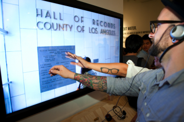 “Rethink/LA,” opening reception, installation view, Architecture + Design Museum Los Angeles, 2011. Courtesy Wild Don Lewis.
LS: You included video and interactive questionnaires and elements, in addition to photographs and collages. How did that diversity of media develop?
KK: We wanted to have narrations of personal experiences of living in Los Angeles. The narrations began as text and then were adapted into film for people to visually enjoy. We wanted to create films that would show the personal stories of the experience of living in Los Angeles, ranging from struggles of sitting in traffic to the decision of getting rid of the car and only taking public modes of public transportation.
The idea behind the chalkboard wall was for citizens to respond to prompts by someone whom they normally don’t have a chance to converse with.
LS: And how did the framing of the future, and specifically 50 years from now come up?
KK: Every 50 years, there seem to be large changes made in Los Angeles. We also wanted to make sure it that it wasn’t too far into the future that people couldn’t relate to it.
LS: The prevalence of cars came up a lot in the discourse around the show. What do you think it would take for LA to transform back into a carless city?
KK: It needs to start with the individuals that live in the city. If there were more people making the change of not driving as much and using public transportation or biking this would cause more of an effect on the people making the changes in our city.
LS: How did you get policymakers involved?
KK: We wanted to make this exhibition about all different types of opinions on the city. We believed that by giving people different statistics, this would help to better inform them of the breakdown of certain factoring elements in the city. I found it extremely interesting that we have 6,000,000 drivers on any given day and more than 1/4 of car trips in urban areas are less than 1 mile. When people see these factors broken down like this I would hope that it would encourage a different way of thinking about how you get around your neighborhood. By involving policy makers into the exhibition, we start to open up these lines of communication that we are all hoping to progress into a stronger relationship for changes for the better in the future.
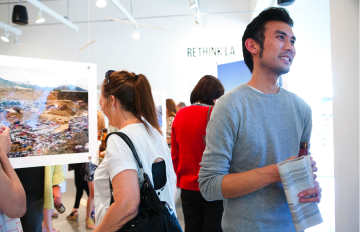
"Rethink/LA," installation view, opening reception, Architecture + Design Museum Los Angeles, 2011. Courtesy Wild Don Lewis.
LS: Rethink/LA is the name of your organization, as well as the title for the show. What’s the larger vision for your organization?
KK: This exhibition was the first project for our organization. We are a collaboration for creative individuals who are intent on re-inventing Los Angeles. We would like to keep partnering with other organizations to keep this conversation going of making a better Los Angeles.
LS: As a designer, what kinds of things did you think about when you were installing the exhibition?
KK: I always find it important to keep things visually intriguing and understandable. You never want someone to walk into a space and be overwhelmed with too many elements. I wanted people to approach the space with the desire to continue their involvement within the space.
LS: I really liked how you displayed the collages and photographs in a way that was sculptural, so you had to physically walk around each piece. It felt kind of urban, like you’re moving through a city of images.
KK: I found it very important for the show to have interactive elements to it. I did not want people to just walk into the space and just look at images on a wall. By suspending the before and after images people have to navigate through the space as if you were walking through the city to these different locations. I wanted people to feel like they were not an outsider looking into the exhibition, but they were a part of it.
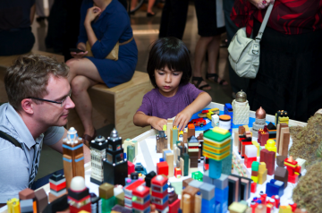
"Rethink/LA," installation view, opening reception, Architecture + Design Museum Los Angeles, 2011. Courtesy Wild Don Lewis.
