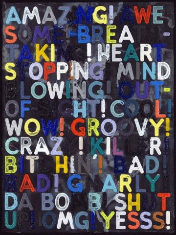
Mel Bochner. “Amazing,” 2011. Monoprint with collage, engraving and embossment on hand-dyed Twinrocker handmade paper, 94 1/4 x 70 3/4 inches 239.4 x 179.7 cm. Image courtesy Two Palms Press, New York.
“At the root of all my work is the recognition that we tend to take most of our experience for granted” (Mel Bochner in “Art in Conversation: Mel Bochner with Phong Bui,” The Brooklyn Rail, May 2006).
Mel Bochner’s recent work barrages the senses with a parade of related words that demand attention. In paintings and monoprints, he blasts the common language of the modern era in capital sans-serif letters across the surface of his choosing, using carefully selected colors that highlight some terms and obfuscate others, sometimes even confusing one word from the next. Though these pieces often provoke an initial response of amusement, even laughter, the viewer is led into a deeper inquiry upon extended viewing. The scale, physicality, and visual impact – coupled with an involuntary compulsion to read the text – provoke a visceral and cognitive response, leading the mind into a labyrinth of free association. These often include collective or cultural connections as well as personal experiences or biases toward the terms on display.
As discussed in detail by Johanna Burton in her essay “The Weight of the Word: Mel Bochner’s Material Language” in Mel Bochner: Language 1966-2006 (New Haven and Chicago: Yale University Press and The Art Institute of Chicago, 2007), Bochner’s work posits questions and opens dialogue rather than provides answers. This seems a natural result of the work of an artist who places inquiry at the center of his practice. “I work by making up hypotheses, ‘What would happen if…’ and then working through the contradictions as they come up” (Bochner in The Brooklyn Rail). Though he has also explored other systems of communication and knowledge (such as measurements, numbers, and spacial geometries and relationships), language has been a central concern from the beginning.
This interest in – and investigation of – language started shortly after he moved to New York in the mid-1960s when he taught at the School of Visual Arts (please see a brief bio here). Though he was a painter, he was asked to teach art history. Perhaps due to his prior study of Phenomenology giants Heidegger and Merleau-Ponty as an auditing student at Northwestern University, this experience prompted him “to think about how visual ideas can be discussed—the relationship between language and images” (ibid.). While at SVA, he also curated a ground-breaking 1966 exhibition (which is now understood as a work of art in its own right), Working Drawings and Other Visible Things on Paper Not Necessarily Meant to be Viewed As Art, shown at the SVA’s gallery. The exhibition was comprised of four binders that contained photocopies of works by his colleagues and contemporaries in art, music, philosophy, biology, engineering, and mathematics, placed on pedestals.
In its infancy, Conceptual art – which was frequently text-based – was thought to bear no trace of personal expression and to exist in a purely cognitive realm; in other words, it did not need to exist as a physical object. Among artists, “an assumption was floating around that using language in your art was a communicative shortcut, a direct route from one mind to another” (Bochner in “Mel Bochner in conversation with James Meyer” in Burton, et al., Mel Bochner: Language 1966-2006, 133). However, in both writings and artwork, Bochner asserted that language itself is implicitly idiosyncratic and political, and that ideas cannot exist without a material component – what he called a “support” – be it a piece of paper, a wall, or a canvas. His position is best exemplified by the now-iconic 1970 work Language is Not Transparent in the collection of the Los Angeles County Museum of Art, in which he painted a messy, drippy field of black paint on the wall and scrawled the words of the title in chalk, as if on a blackboard. Likewise, in the 1969-70 work Theories of Boundaries in the collection of the National Gallery of Art, he explored the relationship between language and physicality.
As previously discussed, Bochner’s investigations of the material presence and hidden biases in language carry through to the present, and the words themselves have become the subject of exploration. This began in 2002 when he found an updated version of Roget’s Thesaurus that included, among the received and “proper” synonyms for any given entry, a significant number of colloquialisms and, on occasion, obscenities. This was a new development for a commonly-used reference book and it intrigued him. “Because the thesaurus is used by children from grade school on up, that signaled a dramatic change in what is considered ‘ordinary’ language. I wanted to explore what had happened to the boundaries of public discourse – linguistically and politically” (Bochner in an address given at the Institute of Fine Arts, New York University, September 2007, as published in Mel Bochner, Solar System & Rest Rooms: Writings and Interviews, 1965-2007 [Cambridge: MIT Press, 2008], 203).
When Bochner first began to work with the thesaurus, he first transposed the entries verbatim. Later, he began to change the order. Over time, the casual elements of speech that initially drew his attention have become increasingly central to the work. These are words we often throw around for effect, rarely thinking of their true meanings or implications. He sometimes focuses on single terms that are repeated across the surface, as in the monoprint Blah, Blah, Blah, 2010 (on view at The Metropolitan Museum of Art’s Johnson Gallery through January 8). Bochner’s intention with this work is “to confront the ideologies and hidden agendas of language” (Bochner in Solar System, 208).
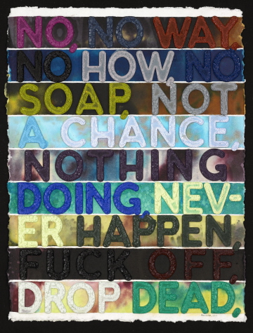
Mel Bochner. “No,” 2011. Monoprint with embossment on hand-dyed and collaged handmade paper. 30 x 22 inches 76.2 x 55.9 cm. Image courtesy Two Palms Press, New York.
Though he has expressed these ideas in paintings, Bochner has also created a series of related but entirely independent monoprints on this theme at Two Palms press in New York City (on view through Sunday at their booth at the IFPDA Print Fair in New York City and again at Art Basel Miami Beach December 1-4). These works stand apart from the canvases in their physical presence – they have a richly topographical surface that could not be achieved with paint on canvas. As such, they are a succinct expression of the artist’s concerns with the materiality of language and his interest in giving words a physical presence and weight. The words themselves are deeply embossed to create a relief surface, and they are so heavily inked that the pigment releases in a series of peaks and valleys when the support is removed from the hydraulic press – a recently completed example weighs over thirty pounds.
The role of color in these pieces – in both the words and background – is fundamental. The overall riot of hues, which either conflict or blend with one another, generates an intended visual overload that forces the mind to oscillate between viewing and reading and generates unexpected and random connections between terms. As Bochner himself describes it, “Freed from any conventional left-to-right reading, the words begin to recombine along new vectors, producing unintended combinations and unexpected meanings” (ibid., 204). At the Two Palms studio, Bochner keeps a library of hundreds of ink colors that he has carefully mixed; each is also recorded in a sample book with notes.
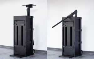
The complex process involves a number of cutting-edge and experimental technologies, including laser-cut Plexiglas and a 14-ton Anderson-Vreeland hydraulic press that exerts 750 pounds of pressure per square inch. The image is printed on thick handmade Twin Rocker paper that is hand-dyed and collaged at Two Palms to meet the artist’s specifications. The matrix for these monoprints is comprised of two layers of Plexiglas, one that contains the words and another that provides a backing. Though the press had been in place for several years, Two Palms founder David Lasry says the idea of laser-cutting the words into Plexi was Bochner’s. They began experimenting in 2002 and 2003 and the first prototype was completed in 2004. The scale and complexity grew in the ensuing years, and the first large-scale, multi-color example was unveiled at the Art Basel fair in 2009.
In recent works, Bochner has experimented with using a range of colors within a single word. In Amazing (illustrated top), 2011, it can be difficult to make out specific terms, as even single letters drop into the darkly mottled background. He has also worked with the varying effects of variegated and striped backgrounds, as seen in two variants of Crazy, both 2011. A monoprint currently in process combines layers of the same words that overlap with one another.
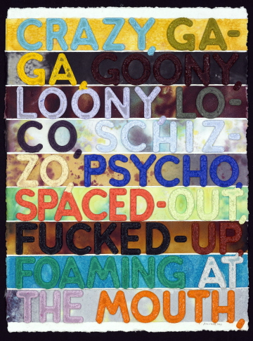
Mel Bochner. “Crazy,” 2011. monoprint with embossment on hand-dyed and collaged handmade paper. 30 x 22 inches 76.2 x 55.9 cm. Image courtesy Two Palms Press, New York.
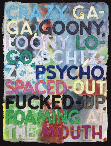
Mel Bochner. “Crazy,” 2011, monoprint with embossment on hand-dyed and collaged handmade paper. 30 x 22 inches 76.2 x 55.9 cm. Image courtesy Two Palms Press, New York.
Through both subtle and bald manipulations of perception, Bochner calls attention to the words that we use every day and gives them presence and physicality so they may be reconsidered. As Burton points out, though these works grew from highly sophisticated concepts, they are “not obscure or difficult to understand; rather, they are unexpectedly accessible” (Mel Bochner: Language 1966-2006, 33). He takes us on an enjoyable ride through familiar territory, pointing out that we are driving blind.
Bochner’s recent monoprints will be on view at the Two Palms Press booths at the IFPDA Print Fair, New York (through Sunday) and the Art Basel Miami Beach fair December 1-4; and at the Metropolitan Museum of Art Johnson Gallery through January 8 (one work). The paintings will be on view at the National Gallery of Art, Washington, D.C. in the exhibition In the Tower: Mel Bochner, opening this Sunday (through April 8, 2012); and at the Whitechapel Gallery, London next year (October 12 – December 30, 2012).
