

[Ed. note: Sarah Hanley’s planned piece on Dana Schutz has been postponed; this week, she takes an in-depth look at the prints of Helen Frankenthaler.]
“Wherever I work, I bring …the same sense of what quality is and what beauty is to every place…”
—Frankenthaler quoted in Thomas Krens, ed. Helen Frankenthaler Prints: 1961-1979 (Williamstown, MA: Sterling and Francine Clark Art Institute, 1980), 26.

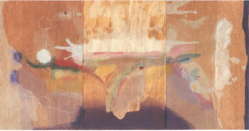
Helen Frankenthaler. "Madame Butterfly," 2000 (Goldman 24). Woodcut in 102 colors on 3 sheets of TGL handmade paper, 41 ¾ x 79 ½ in. (overall). Publisher: Tyler Graphics Ltd., Mount Kisco, New York, edition: 33. Image courtesy Ameringer, McEnery, Yohe, New York.
As the public commentary on Jerry Saltz’s recent obituary for Helen Frankenthaler in New York Magazine makes plain, the late artist inspired extreme opinions, both toward her work and her person. Her lush, gestural, saturated abstractions evoke something close to rapture in some viewers, while others completely disparage her fame and accomplishments, solely attributing them to her privilege and art-world connections (details of her biography are available on Wikipedia). Whether her work is of personal interest or not, her achievements – which are neatly summarized in her New York Times obituary by Grace Glueck – are indisputable.
Frankenthaler’s contributions as a painter are generally the focus of discussion, but her achievements as a printmaker are equal – if not greater – in importance. In fact, she continued to make inroads in this medium and garner critical attention for her editions even after contemporary taste had relegated her painting to the margins. In her essay for the catalogue raisonné of Frankenthaler’s prints, Suzanne Boorsch neatly summarizes her achievements, discussing Frankenthaler’s early use of monoprint in the 1964 lithograph Sky Frame “long before the method became fashionable,” her monumental 1971 lithograph Lot’s Wife, measuring 11’ 2” x 3’, and of course, her 1973 breakthough in woodcut, East and Beyond – the elegance and simplicity of which inspired a resurgence of interest in woodcut, which had been relatively neglected for over a half a century (“Conversations with Prints” in Pegram Harrison, Frankenthaler: A Catalogue Raisonné, Prints, 1961-1994 [New York: Abrams, 1996], 11-12). Boorsch also counts among her notable achievements Frankenthaler’s 1982 monotype session at the Institute of Experimental Printmaking, San Francisco, involving the use of torn rubber to embed embossed and debossed forms within the composition; and Gateway Screen, 1982-8, which incorporated three large vertical intaglio prints in a hinged bronze frame designed by the artist in a variable edition of 12 (the prints were also issued separately as a triptych simply titled Gateway). Absent from this list of highlights is Frankenthaler’s 1977 woodcut Essence Mulberry, which marked a watershed moment both for the technique of woodcut and her development as a printmaker. The catalogue ends in 1994, after which Frankenthaler created two more notable breakthroughs in woodcut: Tales of Genji, a suite of six prints completed in 1998, and Madame Butterfly, 2000 (illustrated top). (For a complete discussion of these and other woodcuts, see Judith Goldman, Frankenthaler: The Woodcuts [New York and Florida: George Brazillier, Inc. and Naples Museum of Art, 2002].)
Like many artists of her generation, Frankenthaler came to the art of printmaking reluctantly. In postwar New York, prints were considered to be a marginal art form practiced by artists who were buried in its technicalities. Painting was supreme and any serious artist focused his/her energies solely on the canvas. As has been repeatedly acknowledged, Tatyana (Tanya) Grosman – a diminutive, gracious, and tenacious Russian émigré – and her husband Maurice changed this attitude when they founded Universal Limited Art Editions (ULAE) in their garage on Long Island in 1957. Armed with a European esteem for the role of the lithograph as a tool of expression, Tanya (who by all accounts was the driving force behind ULAE) doggedly pursued important artists of the New York School until they relented to try their hand in the medium; she then went to extremes both to help realize the artist’s vision as well as ensure that their experience was pleasant and expansive.

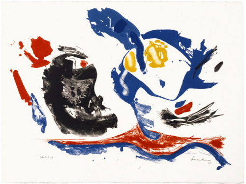
Helen Frankenthaler. "First Stone," 1961 (Harrison 1). Lithograph in 5 colors on Arches Satine white, 22 x 30 in. (sheet). Publisher: Universal Limited Art Editions (ULAE), West Islip, New York, edition: 12. Image courtesy ULAE, Bay Shore, New York.

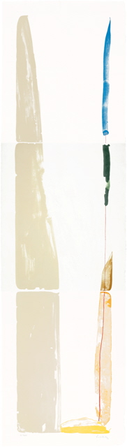
Helen Frankenthaler. "Lot’s Wife," 1971 (Harrison 32). Lithograph in 6 colors on white Japanese handmade paper, 134 x 36 in. (overall). Publisher: Universal Limited Art Editions (ULAE), West Islip, New York, edition: 17. Image courtesy ULAE, Bay Shore, New York.
After a few years of coaxing, Frankenthaler came to ULAE in 1961, primarily spurred by fellow Tibor de Nagy-represented artists Larry Rivers and Grace Hartigan, who had both already made prints and spoke glowingly of their experiences. Describing these initial days in the workshop, she has said, “I was very suspicious and full of questions, and felt that printmaking did not hold for me as something that was part of my involvement in the avant-garde…And the whole idea of it: you put this down in black, and then you mix whatever color you want it in, and you can put down more than one color, and you do it in stages…I was used to doing things all at once, and I had to learn that printmaking cannot be done impatiently if it’s to be done well” (quoted in Krens, 23). She has described First Stone as her “suppose print,” meaning that it was an exploratory image in which she endeavored to answer many of her questions about printmaking (see Ruth E. Fine, Helen Frankenthaler: Prints, [Washington, DC: National Gallery of Art, 1993], 14). Its pooling and meandering shapes echo her painterly concerns at the time – later, her printmaking would inform her painting (ibid., 14 and 31, note 19) and this connection between what she was exploring in her painting studio and the print workshop is maintained throughout her career.
In her initial decade at ULAE, Frankenthaler worked to translate her instinctive approach to the art of printmaking. She began with lithography, then etching, and finally settled on woodcut as her primary means of expression (with forays into screenprinting, pochoir, and later, monotype). On a few occasions, Frankenthaler made prints spontaneously and quickly (Lot’s Wife, above, was done in a single, solitary session), but her process was generally experimental, complicated, and labored – sometimes stretching over several years for a single work (see Krens, 24-5). She approached each project as a unique endeavor with a particular set of challenges; this willingness to explore and carry something through several revisions to achieve a desired result, without regard to difficulty or setbacks, was responsible for her numerous innovations in collaboration with talented and dedicated master printers over the years, a symbiosis she readily acknowledged. In a 1977 essay on her experiences with printmaking, she wrote: “I want to draw my own images, mix my own colors, approve of registration marks, select paper – all the considerations and reconsiderations. Assuming that those who work in the workshop are all artists at what they do, I can then entrust the actual duplicating process to other hands that possess – hopefully – their kind of magic. Sharing and participating to the end” (quoted in ibid., 26).
When Frankenthaler wrote this, she had begun to work primarily with Kenneth Tyler, the famed master printer who left Gemini G.E.L. in 1974 to establish his own workshop in Bedford, New York (for further information on Tyler, see resources below). His tireless dedication to realizing the artist’s vision and his considerable abilities for technical invention suited Frankenthaler’s approach and their collaboration resulted in several landmark prints. Their first major accomplishment came in 1977 with Essence Mulberry, in which she and Tyler developed a number of innovations that allowed her to break free from the hard-edge style of early woodcuts to achieve washes of transparent color. Her first woodcut, created at ULAE (East and Beyond, 1973) was created by cutting a thin sheet of plywood into separately inked and registered shapes. Though it had brought her astounding acclaim (hailed by curator Richard Field as “a departure so profound that virtually all subsequent woodcuts incorporated the thinking it embodied” [quoted in Goldman, 10]), she felt she had sufficiently explored the possibilities of this approach and wanted to push the technique further. In Essence Mulberry, the combination of coated Japanese calligraphy paper (which did not absorb ink), distressed blocks (a process she and Tyler dubbed “guzzying”), and transparent inks offset to a lithography press resulted in an entirely new aesthetic for the woodcut technique (an animated sequence of proofs with commentary from Tyler can be downloaded here).

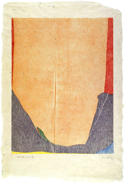
Helen Frankenthaler. “East and Beyond,” 1973 (Harrison 41). Woodcut in 8 colors on buff laminated Nepalese handmade paper, 31 ½ x 21 ½ in. (sheet). Publisher: Universal Limited Art Editions (ULAE), West Islip, New York, edition: 18. Image courtesy ULAE, Bay Shore, New York.
Gateway Screen (1982-88) was another major milestone in the working relationship between Tyler and Frankenthaler, demonstrating their shared persistence and drive. Harrison described the work as “the most ambitious multimedia print project that Frankenthaler has ever undertaken…linking printmaking, painting, and sculpture into a single ensemble” (Frankenthaler: A Catalogue Raisonné, 405). Beginning with three massive magnesium intaglio plates measuring 66 x 26 inches, the artist and printer eventually made 7 plates in total that were printed in 28 colors, incorporating etching, relief, and aquatint and hand-stenciled borders. Three trial prints were then framed in plexiglas and transported to the Tallix Foundry in Beacon, New York, where Frankenthaler forged a tripartite, hinged frame to house the prints. Twelve were cast and the reverse of each screen was uniquely patinated with chemicals and dyes by the artist to painterly effect. (The original prospectus published by Tyler Graphics, with a detailed description of the process and accompanying photos, is available here).
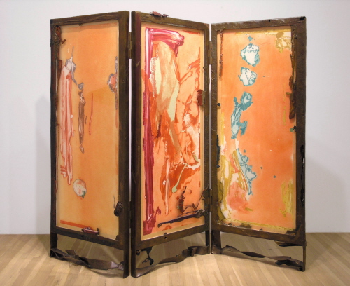


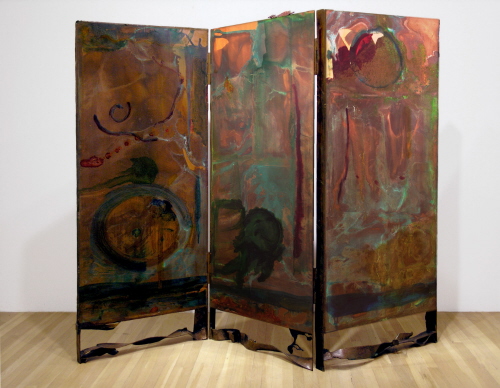
Helen Frankenthaler. “Gateway Screen” (recto, top; verso, below), 1988 (Harrison 154.1). Etching and relief with hand-stenciled margins in 28 colors on white TGL handmade paper, encased in hand-painted patinated cast bronze screen, 81 x 99 x 4 ½ in. (screen). Publisher: Tyler Graphics Ltd., Mount Kisco, New York, edition: 12 (variable). Image courtesy Ameringer, McEnery, Yohe, New York.
Frankenthaler continued to innovate in the woodcut as a mature artist, breaking ground in Freefall, 1992-3, and Tales of Genji, a suite of six prints that would have been a crowning achievement had she not surpassed it a few years later with Madame Butterfly, 2000, arguably her greatest achievement in printmaking. This quietly magnificent image (illustrated top), composed of 46 blocks in 102 colors on handmade paper simulating wood, is at once subtle and enveloping. Goldman notes that its “heartbreaking evanescent quality” and “dazzling serenity belies the difficulty of its making” (Frankenthaler: The Woodcuts, 99). The scope of this project and its complications are revealed in a short animated sequence with commentary from master printer Kenneth Tyler that can be downloaded here.
The literature on Frankenthaler’s prints is surprisingly consistent in its estimation and description of her aesthetic and concerns, in accord with her own commentary on her work. Though Frankenthaler continued to evolve as an artist throughout her career, she held fast to her foundations in the formalist school of painting, even publicly dismissing more recent trends in contemporary art during the National Endowment for the Arts culture wars of the late 1980s (“Did We Spawn an Arts Monster?,” New York Times, July 17, 1989). The idea that her images should appear to be “born all at once” was a guiding principle for Frankenthaler – a mantra of sorts that is frequently quoted. Likewise, the idea of ambiguity – the notion that her gestural marks should tautly vacillate between simultaneous functions (shape/line, positive/negative, superficial/spatial) – is often discussed in the analysis of her achievements. Goldman notes, “It is this hard-won quality that gives rigor to her sumptuous work and keeps it from only being decorative” (ibid., 70).
Throughout the postmodern shift that debunked the romantic ideal of artistic “genius,” she remained convinced that her value as an artist was entirely located in her unique abilities, at one point writing, “the artist’s own wrist is of crucial importance…I believe that the wrist, that sensibility, must be in the whole concept of the making of the print…the artist of quality creat[es] a beautiful graphic that “bleeds” his sensibility – his feelings, magic, head, heart” (quoted in Krens, 29). As she did here, Frankenthaler repeatedly used the terms “beauty” and “quality” to describe her artistic intentions, even after such terms had been deemed problematic by major critics and theorists (condemned as entirely personal, subjective, and grounded in one’s social status and experiences). Yet even scholars often cannot avoid the use of the term “beauty” (or its variants) when discussing her prints (i.e. Fine, 13 [with brief topical analysis]; Richard Field and Ruth E. Fine. A Graphic Muse: Prints by Contemporary American Women [Vermont: Hudson Hills, 1987], 79). The debate over beauty continues to rage – a subject in and of itself – but outside of these dialectics, Frankenthaler graced the history of art with a plethora of images that embodied her idea of it, to the delight and approval of many.
Online resources for Helen Frankenthaler’s prints:
- The Kenneth Tyler Printmaking Collection website, hosted by the National Gallery of Art, Canberra, Australia
- Helen Frankenthaler page
- Photo archives of Frankenthaler (and others) at work at Tyler Graphics
- “OK to print,” video of Frankenthaler at work at Tyler Graphics, 1994 (scroll down)
- Original prospectuses for selected Tyler publications (scroll down for Frankenthaler)
- Website for “Against the Grain: The Woodcuts of Helen Frankenthaler,” an exhibition at the National Gallery of Art, Canberra, Australia, November 26, 2005 – February 5, 2006