
I am not a particularly romantic museum visitor. You know the type, contemplating the works and interpreting the show’s meaning as they stand in the gallery. Instead, I am more the Schwarzenegger, Stallone, or Van Damme type of museum patron. I blaze through the exhibition like a bat out of hell, kicking ass by seeing the entire museum’s shows in an hour or under, and leave the contextualizing for later. At the end of each visit, I grab all of the exhibition pamphlets I can as souvenirs of my conquest.
When contemplating what to write about this month, I realized that I have amassed a rather large collection of these “souvenirs” and, like my collection of arts publications, I have been less interested in the breadth of the collection than I’ve been with the overall quality of each piece. Exhibition pamphlets, posters, and ephemera sit in an odd space of museum/gallery memorabilia. Often they are created with the knowledge that they are going to be disposed of not long after the patron has left the show. Yet some of us do hang onto these disposable sheets of folded paper, and over time they begin to form a collection unto themselves. For this installment of Bound, I’ll survey several of the pamphlets that have risen to the top of my pile.
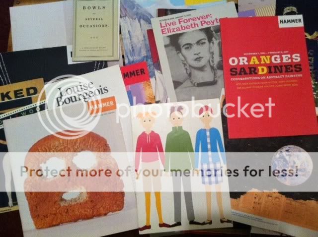
Various exhibition pamphlets from Meg Onli's collection.
Museum pamphlets typically follow a certain format. MOCA in Los Angeles usually produces bland brochures that look like an oversized postcard with some text and a black-and-white image from the exhibition. However, when Japanese artist Takashi Murakami is involved, they create something that is brightly-colored and a little more unique in style. For the 2001 exhibition “Superflat” organized by Murakami (which was also the inaugural exhibition at MOCA’s Pacific Design Center in West Hollywood), the museum’s designers created a simple yet graphic take-away item. The pamphlet (pictured below) was printed on 100 pound dull card-stock that had the size and feel of a Hallmark card. On the outside of the brochure is a detail of groovevision’s chappie 33, (1998 computer graphic illustrator data) and at one edge, a perforated segment that can be torn off and used as a bookmark. The illustration–which looks like an animated advertisement for United Colors of Benetton–is a really sleek image that perfectly evokes the show’s title.
MOCA took a similar approach for Murakami’s 2008 solo exhibition “©MURAKAMI” when they created a small inventory catalogue for their MOCA Louis Vuitton pop-up shop. Featuring the iconic pastel print the artist created for Louis Vuitton bags, this small, saddle-stitched booklet is very minimal, in keeping with the luxury brand’s overall aesthetic. The bold lines and colors from both of these pamphlets make them feel less like pieces designed for a museum, because they utilize the visual language familiar to us from advertisements.
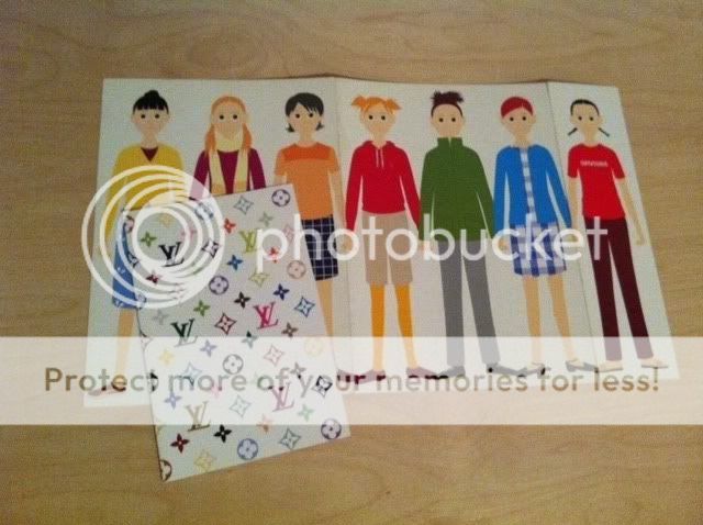
Pamphlet for "Superflat" (2001) and the Murakami Louis Vuitton MOCA Space (2007).
The Whitney Museum put together an excellent pamphlet (pictured below) for Kara Walker’s solo exhibition “My Complement, My Enemy, My Oppressor, My Love” (2007). Consisting of 14 pages and printed in heavy black ink on uncoated stock and folded into a booklet, the brochure segments the exhibition into seven narratives. These narratives, which include negress notes, retelling history, and an historical romance, to name a few, provide multiple entry points to Walker’s arresting images. Aside from the short essays, the booklet’s cover uses a simple type treatment that feels as if it were vintage or historical because of its serif font, but closer inspection reveals it to be created by a contemporary hand–much like Walker’s work itself.
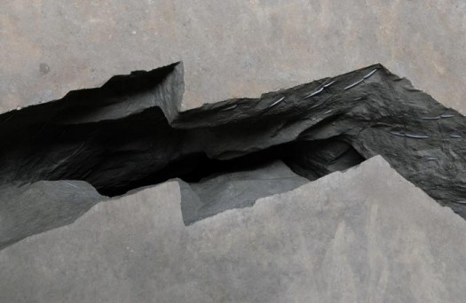
The pamphlet cover for Doris Salcedo’s installation “Shibboleth” (2007) at the Tate Modern provides a graphic representation of her work by way of a stylized white line dividing the deep black space with its very clean type treatment. Unlike the installation, which can simply be described as a very large crack in the Tate’s floor (see image below), the pamphlet’s rounded sans-serif font contrasts with the roughness of the piece itself. Yet, the way the text holds the space between the black and white creates a balancing act that is reflected in the installation’s creation. Meticulously planned, the floor was cracked and then partially filled with sculpted rubble created in Salcedo’s studio; the rubble holds the negative space between cement and its parting. Both the pamphlet and the installation have an aspect of positive and negative space that looks effortless but is in fact planned on a gridded system.
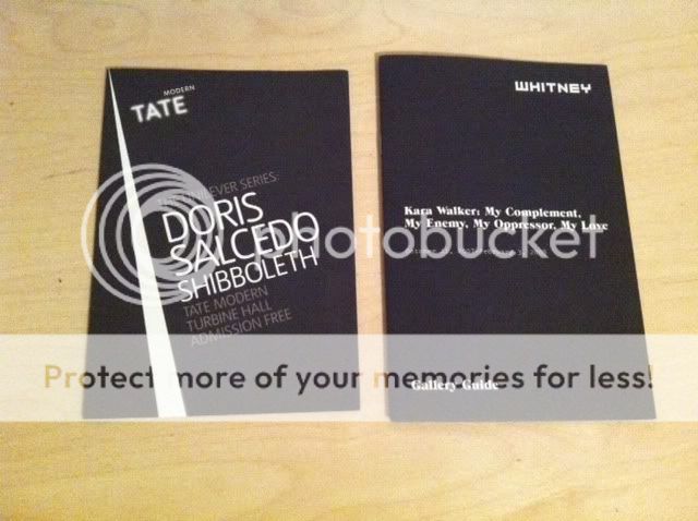
Pamphlet for Doris Salcedo, "Shibboleth" (2007) at the Tate Modern and Kara Walker, "My Complement, My Enemy, My Oppressor, My Love" (2007) at the Whitney.
Although many museums use a template for their exhibition guides, few do it as well as the Hammer Museum in Los Angeles. The museum has managed to create a brand identity that carries throughout the institution, from their vinyl exhibition titles to their 8 x 8 inch tri-fold pamphlets (pictured below). Even their admission ticket, a colorful sticker that reads HAMMER in all caps and a sans-serif font, uses the same logo design as that on the exhibition guides. It’s subtle, yet really effective. Rarely do the Hammer’s guides vary from their standard size, and they were using uncoated paper long before it was fashionable to do so. Even if I am power-walking through an exhibition, these small but important details stand out.
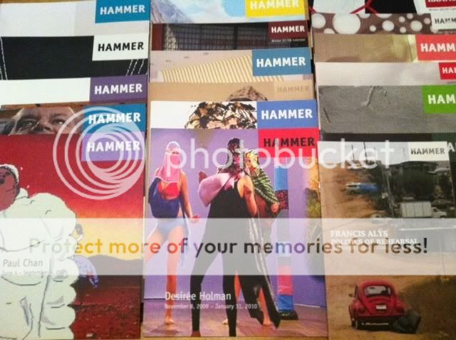
Various exhibition pamphlets from the Hammer Museum in Los Angeles.
Not everyone is going to relish the free printed materials that accompany exhibitions. But when they are designed well and provide interesting content, exhibition brochures can change the way a visitor interacts with or interprets an exhibition. Brochures can even convey a museum’s overall design aesthetic while also emphasizing its commitment to providing accessible guides to the art on view; for this reason museums need to think about how the art they are exhibiting translates on paper. Although all museum brochures contain the same type of information–a brief essay, a photo or two, sponsor credits–it’s how this information is displayed that makes all the difference.


Pingback: Murakami memorabilia | Jasonstirland