I think I had forgotten Mike Kelley was elegant.
His death last week hit the L.A. art world hard. Only hours after it was announced that Kelley was gone, a memorial (which I wrote about in more detail for L.A. Weekly) began to build up in an empty carport in Highland Park, near where he’d lived. It’s inspired by More Love Hours than Can Ever be Repaid, the 1987 wall-hanging piece for which Kelley used handmade stuffed animals, afghans and the like, and by The Wages of Sin, an installation of melted wax originally installed beside the stuffed animal. Because I had confused overstimulation with density, I’d come to associate Kelley with bulk–bulks of materials, bulks of ideas–and I imagined the memorial would mushroom almost immediately, with absurd amounts stuff accumulating on the walls and building up on the floor.
That’s not what happened. It has built up gradually and tastefully, in part because the art world is small and, often, socially tentative, so hardly any memorial for any artist would “mushroom immediately.” But also, Mike Kelley was more intense then dense, and a mass of thoughtlessly accumulated items would not have done him or his work justice at all.
Each item in More Love Hours, the first installation for which Kelley really received acclaim (the “turning point,” L.A. Times critic Christopher Knight called it), had been handmade, slaved over by someone Kelley never met, and then compressed into a conservative rectangular space. Thus, it fit inside the frame of smooth, tasteful “Art” with a capital “A,” though it still had some dirty kitschiness to it.
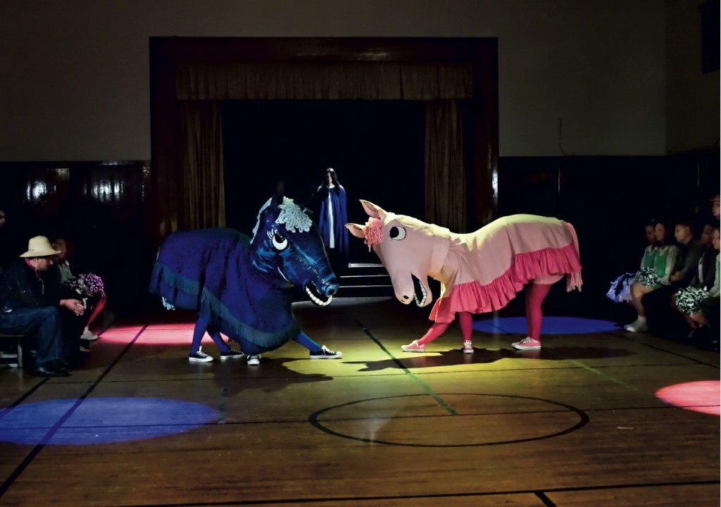
But it’s the project Day is Done from just a few years ago, that, to me, most reveals Kelley’s elegance. In it, Kelley reconstructed scenes based on photos found in high school year books, casting actors who resembled the various teens pictured and bringing these still photos to life with live action sequences. Sometimes, he’d create the sequences by putting different stills on imaginary collision courses with each other, like when he had two boys dressed as Nazis verbally accost a chubby adolescent girl lighting candles, rapping about the girl’s “big fat ass.” I needed “someone to disrupt this somber candle-lighting ceremony,” Kelley told Art 21. “[Rap] seemed like the proper musical form.”

Mike Kelley, "Day is Done," 2005. Installed in 2009 at the Broad Contemporary Art Museum. Courtesy LACMA.
When Kelley installed his various videos, props and soundtracks for Day is Done in Gagosian Gallery in 2005 and later at the Broad Contemporary Art Museum in L.A., there was plenty of floor space, tableaux assembled with beautiful symmetry, colored lights that followed those age old rules (pair analogous colors when you want harmony, complimentary for contrast and extra energy). If you looked at the arrangement of figures on individual screens, what you’d see was almost classical: they’d be centered and the space around them cleared of distraction. Maybe they’d be wearing embarrassingly awkward uniforms, or garish Halloween costumes, but they’d be treated like subjects of well-composed portraits.
Still, Day is Done was described as “packed,” a “sprawling, scabrous spectacle,” and “wall-to-wall pandemonium.” It must have been the content that accosted, because it wasn’t the visuals. Why is it so easy to project the anxiety a subject stirs up onto an artwork’s style?
Writer Dennis Cooper recently read from his new novel, The Marbled Swarm, at Skylight Books in Los Feliz. The novel, while about cannibalism, is written in a deftly controlled way — some sentences could have been written by Edith Wharton. During the question and answer session, Cooper was asked whether it bothered him that Bret Easton Ellis had called him a romantic. “I am a romantic,” he said, noting it bothered him far, far more when people called him a nihilist or sadist. Later, he elaborated: “There’s a response that I always have gotten . . . that I’m propogating ugly things and that I’m a shock meister, that I’m a bad boy. . . That subject matter that I like to work with, it just blinds people. People see red.”
It seems safer, actually, to equate the manner or style of a work with the issues it grapples with, perhaps because it’s easier to communicate visual and physical sensation than meaning. If you describe something as over-packed, dense pandemonium, then you don’t have to grapple with why it tears into your heart strings and makes you want to run away.

