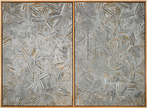
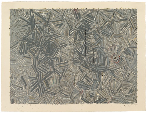
Jasper Johns. “The Dutch Wives,” 1975. Encaustic and collage on canvas (two panels mounted together). Collection of the artist. Art © Jasper Johns/Licensed by VAGA, New York, NY. Photo: Digital Imaging and Visual Resources, Harvard Art Museums, © President and Fellows of Harvard College.
The Dutch Wives, a subject Jasper Johns treated in both painting and screenprint (in 1975 and 1977, respectively), serves as the locus of a cogent and tightly-curated exhibition titled Jasper Johns/In Press: The Crosshatch Works and the Logic of Print, on view at Harvard Art Museums through August 18. The exhibition, which unexpectedly blossomed from an undergraduate seminar, explores themes and concerns in the artist’s work from the late 1960s to the early 1980s, particularly as they relate to printmaking. Though Johns’s proclivity for print is well established, the exhibition resituates the medium – through sustained and comprehensive analysis of these twin compositions and the artist’s related works – as the lynchpin of his work as a whole.
Jasper Johns. “The Dutch Wives,” 1977. Screenprint from twenty-nine screens on Kurotani Kozo paper. Printed by Kenjiro Nonaka, Hiroshi Kawanishi, and Takeshi Shimada, at Simca Print Artists, New York Harvard Art Museums/Fogg Museum, Gift of Harry Kahn, M23358. Art © Jasper Johns/Licensed by VAGA, New York, NY. Photo: Digital Imaging and Visual Resources, Harvard Art Museums, © President and Fellows of Harvard College.
To create the two versions of The Dutch Wives, Johns used strips of text from The New York Times that he obscured with layered media (encaustic or screened ink) in the form of hand-drawn hatch marks in various shades of gray. In both painting and print, the work is divided into two halves of equal dimension and similar composition – the line-pattern for each is the same and the texts are apparently replicated – but they differ in important ways. In the painting, Johns applied actual clippings from a newspaper to the canvas (two copies of the same date); while for the print, Johns created a collage (from two newspapers of a different date) that was photographed and transferred to screens, then printed to the paper. In each, the hatch mark pattern is interrupted by occasional drips or splashes of gray and random fine lines or streaks in reddish- or pinkish-orange and green, but these random effects differ in painting and print (these subtleties are difficult to see in reproduction but are apparent in person). The right side of the painting also incorporates a circular mark from the lip of a tin can that was impressed into the waxy paint before it hardened; this element is printed in the editioned work.
From these basic facts, a universe of meaning is derived by the curatorial team, who offer a detailed examination of these now-canonical images, as well as a feast of interpretations. These efforts were led by Professor of History of Art and Architecture Jennifer L. Roberts, who also wrote a compelling and well-researched essay for the catalogue in which she posits printmaking as the “master logic of Johns’s career” (“The Printerly Art of Jasper Johns” in Jasper Johns/In Press: The Crosshatch Works and the Logic of Print [Ostfildern: Hatje Cantz Verlag, 2012], 14). Individual catalogue entries were written by PhD candidate and curatorial intern Jennifer Quick, and Roberts’s four undergraduate students contributed focus essays that are published digitally (available in the galleries and online): topics include an in-depth discussion of Johns’s use of newsprint and its cultural implications; an analysis of selected tenets of queer theory to be located in the work; an examination of perceptual themes to be found in Johns’s approach (on the processes of looking and visual memory); and the artist’s unorthodox representation of space and dimensionality.
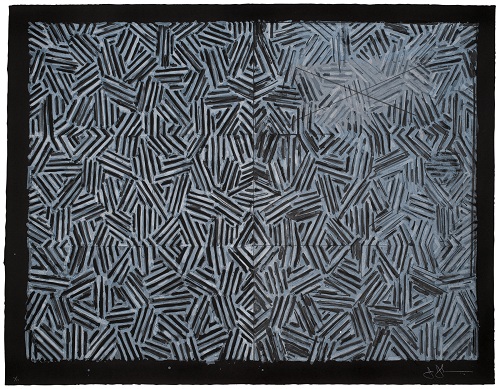
Jasper Johns. “Corpse and Mirror,” 1976. Lithograph from twelve aluminum plates on German etching paper. Printed by Bill Goldston and James V. Smith at Universal Limited Art Editions (ULAE), Long Island, New York. Harvard Art Museums/Fogg Museum, Margaret Fisher Fund, 2011.111. Art © Jasper Johns and ULAE/Licensed by VAGA, New York, NY. Published by ULAE. Photo: Digital Imaging and Visual Resources, Harvard Art Museums, © President and Fellows of Harvard College.
The exhibition of twenty-one objects is culled primarily from the Harvard Art Museums’ collection, with important loans from the artist, Jean Christophe Castelli, and Harvard’s Houghton Library; the Art Museums also acquired the lithograph Corpse and Mirror expressly for this exhibition. The two works that form the heart of the exhibition are attended by a selection of prints and works on paper by Johns that illuminate themes of repetition, layering, symmetry, mirroring, and dimensionality that pervade the artist’s work during this period and support the arguments put forth by Roberts and her students. Also included are a handful of disparate works that provide historical and contemporary contexts for Johns’s work, ranging from a selection of cylinder seals from ancient Mesopotamia to a 1971 lithograph by Sol LeWitt; these lend a didactic whiff to the otherwise elegant grouping, but the impulse can be forgiven in the context of a teaching museum, where it is rightfully assumed that not all visitors come through the doors armed with in-depth knowledge of art history.
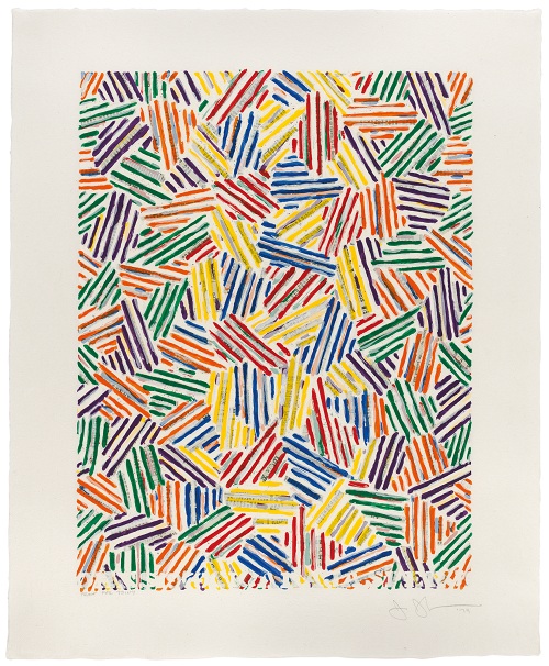
Jasper Johns. “Cicada,” 1979. Screenprint from sixteen screens on Kurotani Hosho papet. Printed by master printers Kenjiro Nonaka, Hiroshi Kawanishi, and Takeshi Shimada at Simca Print Artists, New York. Harvard Art Museums/Fogg Museum, Loan from Collection Jean Christophe Castelli, Class of 1985, 32.1999. Art © Jasper Johns/Licensed by VAGA, New York, NY. Photo: Digital Imaging and Visual Resources, Harvard Art Museums, © President and Fellows of Harvard College.
Also on view in the gallery (and online) are two documentaries by Katy Martin that document Johns’s collaboration with the master screenprinters at Simca Print Artists to create the editions Cicada, Usuyuki, and The Dutch Wives. Silkscreens (1978, DVD from Super 8mm film, color, 20 minutes), which documents the printers as they edition The Dutch Wives, is an instructive piece that will primarily be of interest to those who are unfamiliar with the process of screenprinting. On the other hand, Hanafuda/Jasper Johns (1978–81, DVD from Super 8mm film, color, 35 minutes) is an extraordinary bit of filmmaking, not only for the meditative dialogue between the artist and the filmmaker on his approach to printmaking, but also for its rare footage of the artist at work – witnessing his graceful physical presence, regal voice, careful manner, and elegant, precise hand is something of a revelation in light of the artist’s famously aloof and intensely private nature. Discussing his work on the screenprints, he states, “I am always interested in the physical form of whatever I’m doing and often repeat an image in another physical form just to see…what it is that connects them and what it is that separates them because…the experience of one is rarely the experience of the other, for me anyway.” This idea is familiar – he made a similar and oft-cited statement in a contemporaneous interview with art historian Christian Geelhaar (see ibid., 14; and note 18, 40) – but it bears special consideration in light of this exhibition.
In addition to those previously discussed (and aside from the obvious differences between the two media, i.e. the textured brushstroke vs. a flat layer of color, a canvas vs. paper support, etc.), there are significant points of departure between the painting and the screenprint of The Dutch Wives. As noted in the exhibition label copy and catalogue entry for the screenprint, the two identically-patterned halves of the composition are more obvious in the painting, where they are set apart by distinct frames, but the “separate panels have been conjoined in the print, making it more difficult to perceive that the two halves of the composition are imperfectly twinned replications” (Jennifer Quick, “Catalogue” in Jasper Johns/In Press, 76). By extension, the frames on the painting abruptly finish the edges of the two halves of composition, while the edges of the printed image, with its generous margins, taper off in messy splatters and exposed bits of text strips. As will also be clear to any close observer, the newsprint elements of each composition are no longer the same tone; those in the painting have altered to a deep amber tone with age while their corresponding printed components in the screenprint remain creamy white. This last fact is discussed in depth by Jacob Cedarbaum as a purposeful reference to temporality that “pose[s] critical questions about physical decay and informational obsolescence” (“Reading the Fine Print: Jasper Johns, Newspaper, and the Media” in Jasper Johns/In Press: Companion Essays [Cambridge: Harvard Art Museums, 2012], 14).
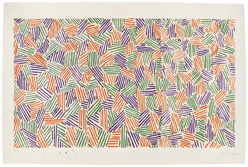
Jasper Johns. “Scent,” 1976. Lithograph, linocut, and woodcut from four aluminum plates, four linoleum blocks, and four woodblocks on Twinrocker paper. Printed by Bill Goldston, James V. Smith, and Juda Rosenberg, at Universal Limited Art Editions (ULAE), Long Island, New York. Harvard Art Museums/Fogg Museum, Special Purchase Fund, M19954. Art © Jasper Johns and ULAE/Licensed by VAGA, New York, NY. Published by ULAE. Photo: Digital Imaging and Visual Resources, Harvard Art Museums, © President and Fellows of Harvard College.
Roberts’s rigorous but highly readable essay in the published catalogue will be of particular interest to scholars and aficionados both of Johns’s work and of prints. She begins by acknowledging that the significant relationship between Johns’s painting and printmaking has been examined in the past by prominent art historians such as Barbara Rose, Riva Castleman, and Richard Field, but upsets the traditional primacy of work on canvas in such arguments, asserting that the “conceptual and technical arrow largely points in the other direction,” stating “his rapid and even voracious adoption of [printmaking] suggests that he recognized an essential kinship between printmaking and the strategies he had already developed in painting” (“The Printerly Art of Jasper Johns,” in Jasper Johns/In Press, 14). This position is supported by an extended analysis of Johns’s artistic concerns in relationship to the technical facts of printmaking, including his desire to move away from the autographic and expressionistic art of the 1950s, his aforementioned interest in the changes that are evident when the same idea is expressed in a different medium, the representation of space and volume without resorting to traditional systems of perspective (particularly the suggestion of a cylindrical form to the work, corresponding to the physical process of intaglio and relief printmaking processes, which involves rolling a large cylinder over the matrix), and the use of repetition, rotation, mirroring, rotation, sequencing, layering, and serialism. Special emphasis is given to the role of the strips of newspaper in The Dutch Wives, which she notes have traditionally been “scrutinized for their occult content rather than analyzed as particular kinds of printed, material artifacts” (ibid., 21). Roberts argues that this is an intentional nod to the mechanics of letterpress printing, corresponding to the cast bars of type (slugs) used at the time – a technique that began to fade into obsolescence around the same time Johns was creating these works. Roberts thus declares his use of this material prescient of the major changes in communication that have taken place over the ensuing decades as our society has adopted an entirely digital means of communication, concluding that “Johns’s work might help us better understand the stakes of our ongoing negotiation of the ‘death’ – and the future – of print” (ibid., 39).
This is an ambitious argument to place on the shoulders of a relatively small selection of work, but the thesis is sound and opens the possibilities for further investigation within the artist’s prolific career as well as his influence on contemporary art. As noted by Roberts, Johns’s early focus on printmaking established a shift to the mechanical means of art production adopted by a number of artists in the 1960s and ‘70s (such as Warhol, Judd, and LeWitt) that acknowledged a sea change from a mechanical to a post-industrial culture (ibid. 34-5, 38-39). This influence is apparent in today’s landscape of multi-media art, as well as a continued exploration in the ways that the mechanical process of printmaking correlates to everyday experience in the information age, as seen in the work of Ryan McGinness, Shepard Fairey, Swoon, Nicola López, and a host of other young artists working today. Such art has elevated printmaking from its traditionally second-class status, establishing it as one of many equally valid means of expression from which an artist can choose. As shown in Jasper Johns/In Press: The Crosshatch Works and the Logic of Print, Johns was among the first to unlock this potential.