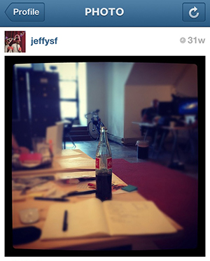
jeffysf: “And so my new life of documenting my daily existence begins, one hip pic at a time.”
Ever since I got an iPhone thirty-one weeks ago, my life on Instagram has been a complete joy. For multiple reasons, I deactivated my Facebook account earlier this year, but I’ve been channeling the zeitgeist’s behavior of digitally socializing through Instagram. It’s a fun application with emphasis on the visual image rather than text, though the text-based comments appearing underneath the pic can be helpful and entertaining. I like to think of it as an art exhibition that sometimes comes with wall text.
Having been through art academia, I’ve been bombarded with art history, theory, and practice. When using a simple visual app like Instagram, I can’t help but display the stuff I’ve picked up from teachers, textbooks, and classmates: classic Greek proportions, modern complimentary colors, and contemporary aesthetics inform my decision-making when snapping a pic to share with the world. Below are some examples of this strange behavior.
Paul Cézanne. “The Blue Vase,” 1889-90. Image from ibiblio.org.
Just like painters from a by gone era, the first thing I snapped on Instagram was a beautiful still life on my office desk. The long and slender coke bottle coupled with a radial blur was the perfect test subject for my novice experience. It’s no wonder why the first thing I learned in elementary school was how to draw what was right in front of me.
Georges Seurat. “Un dimanche après-midi à l’Île de la Grande Jatte,” 1884-86. Image from wikipedia.org.
Once upon a time, people used to gather for wonderful Sunday afternoon picnics. Those days are over (except for right here in San Francisco’s Dolores Park – It’s crazy!) and are replaced by poolside parties. The photo above happened to be taken at the 2012 San Francisco Art Institute MFA show reception at The Phoenix Hotel.
jeffysf: “Puppies”
Google image search results for “madonna and child,” from chinaoilpaintinggallery.com
I love Jesus. I love images of Jesus. I love a mother and child. I love a man and a dog. Some things are just timeless. Or at least around 2,000 years old.
jeffysf: “Tacolicious!”
Catherine Opie. “Untitled #40 (Freeways).” Image from nytimes.com.
When I learned about Catherine Opie’s freeway photographs in college, I instantly remembered the first time I visited Los Angeles when I was a kid. I remember thinking that the lines of the underside of highways were so cool. The inside of one of San Francisco’s Tacolicious restaurants was just like it.
jeffysf: “Laying on the gym floor.”
Barnett Newman. “Onement 1,” 1948. Image from wikipedia.org.
Who doesn’t love a nice straight line? When I’m at the gym, I listen to music on my iPhone, but my arms are too small to have one of those armband-iPhone-holders, so I just hold my iPhone the entire time. It’s awful, but I’ve learned to deal with it. After doing a hundred sit-ups, I took the photo above. I like to relate Barnett Newman’s idea of creating the universe from a zip to my own attempts to create killer abs.
jeffysf: “Poor and digitally inclined man’s Richard Serra. #contemporary.”
Richard Serra. “Blind Spot Reversed,” 2003-2005. Image from guggenheim.org.
Whenever I see a serious reference to art in the world, I snap a pic and call it a “poor man’s'” whomever. It’s something I just have to do.
jeffysf: “I match Rothko’s ‘No. 14, 1960’. #modern.”
This is one of the few times that photography at a museum is okay. I took the above photo at the SFMOMA.
jeffysf: “It’s noon. It’s Steelers. It’s only weird if it doesn’t work. #funday.”
Claude Monet. “Water Lilies, Evening Effect,” 1897-99. Image from wikipaintings.org.
So above, you’ll find an example where the accompanying text might not make sense to you. It may make sense if you know where the “weird” line comes from. Otherwise, look at the image as a beautiful compositional nod to Monet’s famous water lilies – circular elements leading off into a distant vantage point.
jeffysf: “mele kalikimaka #comfy.”
Damien Hirst. “Methoxyverapamil,” 1991 (detail). Image from guardian.co.uk.
DamienHirst’s organized spots came to mind before Yayoi Kusama’s, mainly because of all the hoopla about him leaving Larry (Gagosian). Drama! The above image is the cool pattern on my bed sheets at the rental house I stayed in for a few days in November.
Yes, this post ends abruptly, but what it really is, is 1) a free advertisement for Instagram, and 2) an aggressive nudge for you to artfully analyze your own Instagram feed. The app even has a 3×3 grid which overlays over the screen to make a fantastic rule of thirds composition. Oddly, that’s the one thing I never learned in school but, instead, discovered from watching Jeopardy. So the next time you’re about to snap a pic, Instagram or not, ask yourself: Am I about to reference an artist or artwork in this pic? (Also, follow me on Instagram: jeffysf).
