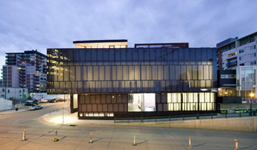
Another approach to museum transparency that I admire is that of the Museum of Contemporary Art Denver. When you open the homepage of their recently re-designed website, you’re immediately confronted with two things – museum statistics and the question, “What’s it to you?” This theme of visitor feedback and museum stats are interwoven within the content on every webpage. The strong emphasis they place on public engagement also comes through in the choices they give to their website visitors. The visitor is able to select how they prefer to process certain types of information – for example, would you like to view the exhibition archives organized by images or text? The website tailors it’s content towards the way you’d like to interact with it.
I had an opportunity to speak with the MCA’s Director and Chief Curator, Cydney Payton, on the phone about this focus on visitor experience, and to find out if this idea extends into the galleries as well.
With their new website, Payton wanted to challenge the museum to think about their audience in a more global and interactive way. Through the website, the MCA hopes to foster an appreciation their audience already has for art and to further educate them about what the institution is trying to achieve. Contemporary art should not only be for an insular audience, but it should be able to attract a variety of audiences. If you don’t convey this within a framework that those who are technologically savvy relate to, you’re not going to attract them. Through the internet, they have the ability to connect to that audience, both within Denver and beyond.
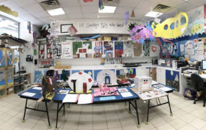
I asked if this idea of visitor experience extended beyond the web and into the galleries as well. She described how this is carried through to their MI 5™ program. This educational program uses Howard Gardner’s Theory of Multiple Intelligences (MI), which explains that through different learning styles, individuals process information and produce their understanding of information most effectively through a particular kind of intelligence. The program focuses on five (musical, mathematical, visual, verbal, and kinesthetic) of these intelligences and provides interactive tools that cater to each. The idea is to allow every single person that comes into the museum to access it through an intelligence that’s customized for the way they learn. This also plays into how the website was thought about – it constantly acknowledges the different ways people gather information and builds their own personal experience with it.
As she stated, “We want people to feel that the MCA belongs to them, that it’s not a separate institution that’s doing something for them, but that they’re doing something for us too.” She included that they are inverting a lot of the language and dialogue that’s existed for many years in the museum field, and felt that as a non-collecting institution it was both a benefit and a responsibility to be constantly in motion. “You’d hope places like MCA Denver were trying to push things and experiment.”
So far, they’ve only received positive feedback from their online users. Their hope is to continue to add layers to this approach and take what the museum field is doing and translate it into new ideas. I’m excited to watch as this evolves, and I hope the level of transparency and interaction that both the MCA Denver and IMA participate in continues to spread. What do you think of these ideas, and where would you like to see it go from here? What other museums would you add to this list?


