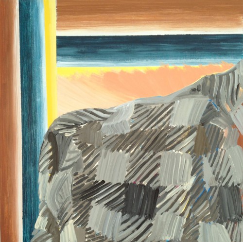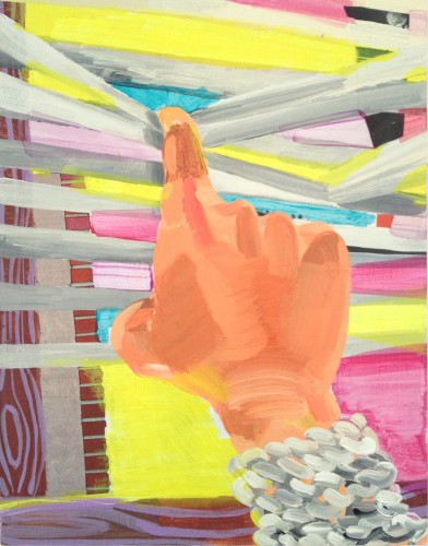
Mandolyn Wilson Rosen. “Knit Cuff,” 2012. Acrylic and collage on wood panel. 14 x 11 in. Courtesy the artist.
Over the past month, Mandolyn Wilson Rosen and I have been emailing about her recent paintings. The following conversation focuses on her investigation of painted space as she pulls from her direct surroundings. Rosen’s work can be seen in Rainbow Juice, a project by Birgit Rathsmann and David Lukowski that opens on March 16 and is up through April 13 at Helper studio and project space in Brooklyn.
Amanda Beroza Friedman: Some of your paintings feature obstructed views, windows or curtains. Do you think of these as framing devices? They create a push and pull, surfacing a dialogue between interiority (home, the mind, isolation) and what’s outside.
Mandolyn Wilson Rosen: In 2011, I started a series of paintings and collages based on the view from my living room, which was about four feet from my landlord’s building. One of my windows looked right onto an exterior wall, covered in these crazy mauve shingles with a repeating fake wood grain printed on them. I ended up building several works around the shingle pattern. Then I made paintings that resembled views into and out of windows and walls, using the patterns of architecture (wood, brick, and flagstone) and of my home (rugs, curtains, clothes, plants). Those led to pieces where I use striped bands or other graphic elements to partially frame one part of the painting in order to create a kind of enclosure.
ABF: How do you reconcile the studio, home, and exhibition environments in your painting’s space and/or the space of painting more generally?
MRW: Rather than attempting to reconcile the three, I’m trying to make work that acknowledges these different surroundings. For a show I did in Brooklyn last year at This Must Be the Place, I showed domestic-scale paintings that depicted interiors and walls, keeping in mind that the gallery had recently been converted from an apartment. My studio is in my home, so the stuff around my house has poked into the work for the last couple of years.
ABF: And in the past you have made overt installations with your paintings.
MWR: Yes, one was in 2008 at Incident Report, a storefront art space in Hudson, New York. In that project, I used camouflage to confuse the notion that the paintings were for sale. Another one was an installation at the painter David Reed‘s studio in New York that same year. It incorporated separate paintings into a painted environment that called attention to mundane features of the room, like the air duct overhead. The work I’m doing now is not installation-based, but focused instead on pulling the elements I’ve worked with in the past apart into smaller works.
ABF: In line with this, it is my understanding that now, rather then putting all of your content into one piece, you are trying to let a group of paintings do the talking. Could you explain this?
MWR: I used to try too many ideas out in the painting I happened to be working on. Now, I work out a specific idea in one piece and then move onto another solution of the same idea in the next painting, knowing that the works might inform each other. I just saw the Matisse show at the Metropolitan [Museum of Art] and was excited to see that he worked that way, too. It’s so obvious, but it does take a lot of self-control.
ABF: When looking at some of your paintings I get the feeling that there are people under the patterning. Can you address repetitive gesture, opticality, and decoration as they relate to your work and perhaps their connection to the psyche and the home?
MWR: Opticality seems to be a bad word in post-modernist circles, because it harkens back to the Greenbergian supremacy of flatness in painting. But I think shallowness is interesting, a near-flatness that can come from recreating graphic patterns in paint. Sometimes I treat pattern tightly, like a sign painter, and sometimes sensuously. Tight, repetitive forms that have been hand painted can hint at madness. I like the tension of that when brought to bear on a benign-looking interior. It helps create a feeling of compressed space. That compression also results from blocking a view out a window or bringing everything smack against the picture plane. After I had children my life began centering around our home much more, and the order and design of each room and its surfaces became this impossible ideal in my mind that was easier to mock in painting than to actually try for at home.
ABF: Along with shallow space, you’ve mentioned the importance of haptic space in your paintings.
MRW: I try to keep in mind the idea of “haptic space,” which is whatever is within reach, or space that is delineated by routine gestures. When you acknowledge this scale while painting, it can make the work suddenly jump into the room and pick up on the stuff around it. If it’s done well, like in the work of [Francisco de] Zurbaran or [Jean Baptiste Siméon] Chardin, then the painting is also working on this illusionistic level that is almost sinister in its awareness of you. I’m not after illusionism. I tend to layer one element at a time, perhaps unconsciously as I make decisions, and those layers end up collapsing what would otherwise be illusionistic space.
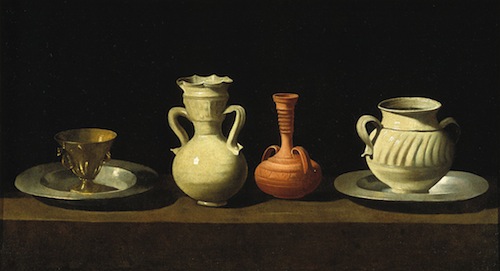
Francisco de Zurbaran. “Bodegon (still life),” 1658-1664. Oil on canvas. 18 x 33 in. Collection of Museo del Prado, Madrid.
ABF: Eyes appear in some works. Are they stand-ins for the body or you, the artist?
MWR: You could say both, really. I think they make the patterned ground they’re in become suddenly inhabited. And it’s funny to me, like I’m trying to give the painting a point of view. I think about Philip Guston‘s disembodied eyes, heads and hands, which are so darkly funny as a way to show the isolated art studio existence.
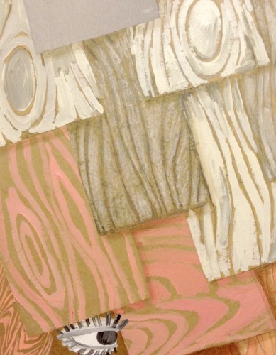
Mandolyn Wilson Rosen. “Poor Mom (for Molly Drake),” 2012. Acrylic and collage on wood panel. 14 x 11 in. Courtesy the artist.
ABF: I relate to that—looking, always looking, a looking awareness. You started with taking photographs. Does the action of seeing through a camera lens factor into putting together a painting for you?
MWR: Yes, though I was painting before I chose darkroom photography as my major at Cornell. I was more interested in collage and photographers like Lucas Samaras, who manipulates his Polaroids, and Victor Burgin, who combined images with text and in series, than I was in straight photography. I got back into painting after college and I realized that I tend to organize a painting in layers of imagery or pattern, so that comes from collage. I photograph stuff for reference, which helps me to design patterns and color combinations. I had good, simple advice once from the cinematographer Arthur Jafa in graduate school at Bard, which was to use the digital camera to throw my painting out of focus while working on it, in order to see it differently or give myself a little distance from it. I do that all the time now.
ABF: The iPhone makes taking process shots of work so fluid, I definitely find it to be a helpful studio tool. What artists have you been thinking about lately?
MWR: I think about Eileen Quinlan‘s photographs and always Mary Heilmann’s paintings because they both do what I’m trying to do, which is absorb the stuff of their surroundings into transcendent abstraction. Seeing Heilmann’s work for the first time around 2007 made a big imprint on my thinking about committing to marks and letting my moves show. There is an apparent ease to her work that I find just amazing.
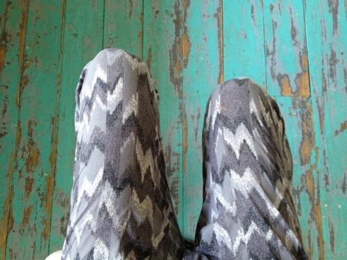
Mandolyn Wilson Rosen. “Untitled,” 2012. Digital photograph. Dimensions variable. Courtesy the artist.
ABF: And what have you been reading lately?
MRW: When Richard Artschwager died last month, I came across a conversation with him in the Brooklyn Rail from 2008. He said that a good place to look for ideas is “underfoot.” He advised artists to check out whatever is “unthinkable,” which for him at the time meant depiction and perspective in the age of Abstract Expressionism. I’m also re-reading Norman Bryson’s book Looking at the Overlooked; it’s four great essays on the cultural load carried by still life painting. It’s goes into the contested idea of “feminine space,” money, morality, and what Bryson terms “megalography,” art that aspires to greatness (as opposed to “rhopography,” the study of things one might call mundane or that seem to have no narrative). That idea of rhopography ties into what Artschwager was up to, and is informing the direction things are going in my studio.
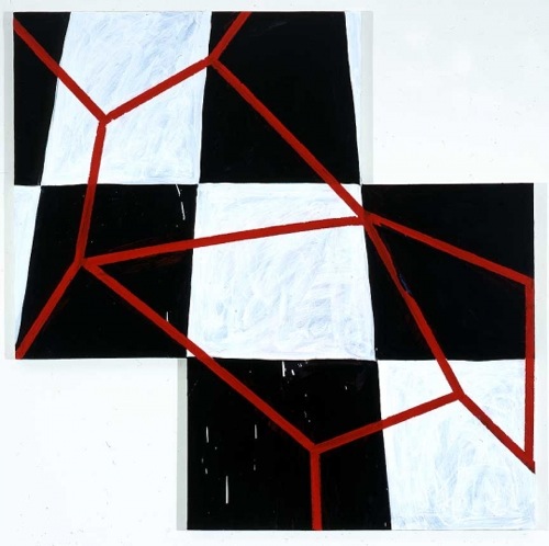
Mary Heilmann. “Blood on the Tracks,” 2005. Oil on canvas. 54 x 54 in. © Mary Heilmann. Courtesy the artist, 303 Gallery, New York and Hauser & Wirth, Zürich London.
ABF: Mundane, no narrative—will others want to look at your paintings then? Do you think about the viewer’s experience?
MRW: They might not! I gave up a while back trying to address an imaginary viewer, because there is no accounting for whatever anyone might bring to an artwork when viewing it. It’s more freeing to me to just focus on figuring out whatever problems I am trying to solve in the work. Right now, I am making a painting that continues my efforts at using a pegboard pattern to describe a space that’s only a few inches deep. It’ll be an upright studio still life, with sketches or tools “hung” on the pegboard. I’m thinking about those seventeenth-century Dutch letter rack paintings, but also the loose grids of Heilmann. I’ve given myself the insane task of painting all these little holes. I guess trompe l’oeil painting presupposes that there is an eye to be fooled, right?
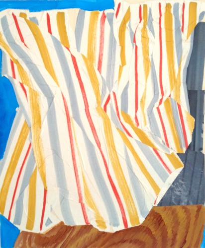
Mandolyn Wilson Rosen. “Smells Like Rain,” 2012. Acrylic and collage on wood panel. 24 x 20 in. Courtesy the artist.
Amanda Beroza Friedman is Blogger-in-Residence through March 29, 2013.
